How to Create a Calligraphy Signature for Your Email
Create a readable calligraphy email signature, compare six fonts, export a transparent PNG, and check the lettering at its final display size.
To create a calligraphy signature for your email, turn your name into a short, readable lettering image, export it as a transparent PNG, and add it to your email signature alongside ordinary contact text. Choose the font at the size people will actually see in an email. A beautiful preview can become difficult to read when it is reduced to a small sign-off.
The aim is to give your message a personal visual finish while keeping the practical information easy to use. Your name can appear in script; your job title, phone number, website, and other details can remain selectable text. This guide covers creating that lettering image, comparing styles, and preparing it for an email signature editor.
What a calligraphy email signature includes
A calligraphy signature is a font-based image of a name or short sign-off. It can resemble handwriting, but it is created from an existing typeface rather than from a scan of your own handwriting. The same font produces different results for different names, so choosing from a sample alphabet is less useful than previewing your actual words.
Keep the decorative part compact. A name such as “Alex Morgan” gives the reader a clear focal point; putting a name, title, company, phone number, and slogan into one script image makes all of them harder to read and update. Think of the image as one element within your signature rather than the entire contact block.
| Element | Suggested treatment | Reason |
|---|---|---|
| Name or short sign-off | Calligraphy image | Adds a personal visual touch |
| Role and business name | Ordinary text | Remains easy to read and update |
| Email address and phone number | Ordinary text | Readers can select or copy the details |
| Website or booking link | Text link in the email editor | Gives the action a clear label |
Choose a style using your own name
Compare the six distinct candidates below, then keep two or three finalists for your own name. Look at the capital letters, the spaces between words, and the small loops inside letters such as a, e, and o. If you have to read your own name twice to recognize it, another reader is likely to find it difficult too.
The following examples were generated with the Free Calligraphy Text Generator using the same text, “Alex Morgan,” at size 72, with left alignment, line height 1, text color #1E2129, no stroke, and the background switched off. They are shown at the same width to make the design choices easier to compare. These settings are a reproducible starting point, not a required email signature specification. Find Authentic in the Signature group, and Caveat and Alex Brush in Handwritten.
Autography for a relaxed handwritten look
Autography gives this name rounded, open shapes with a distinctive capital A. It is a useful candidate when you want the lettering to feel approachable without filling the signature with extra decoration. Check the connection between the capital and the following lowercase letters, especially when substituting a longer first name.

Agustina for a sweeping autograph style
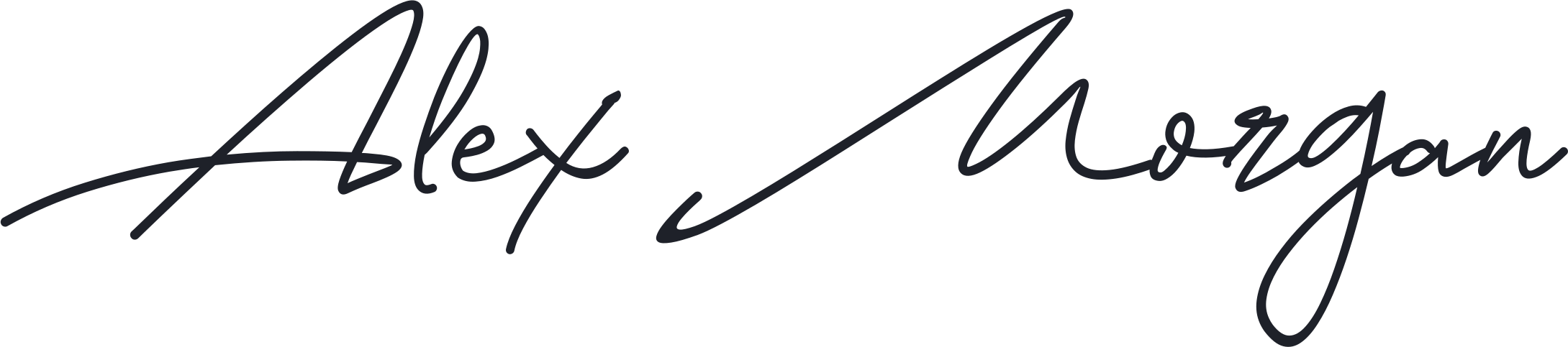
Agustina makes the initial strokes prominent and gives this name a wider, more expressive silhouette. That can suit a personal brand or a creative professional, but the long strokes need room around them. Preview the complete image in the email editor so that decorative ends do not sit against a column edge or another line of text.
Allison for a lighter signature
Allison gives this example a finer, lighter appearance. That makes it worth considering for an understated sign-off, provided the smaller strokes remain visible at the final display size. Compare it with the heavier candidates in an actual message rather than judging it only in an enlarged preview.

Authentic for a stronger, compact autograph
Authentic gives “Alex Morgan” thicker downstrokes and a more compact rhythm than the airy Allison sample. The tall A and M remain prominent, but the smaller letters carry more visual weight. Inspect the tight join around “lex” and the lower loop of g when reducing it. More weight helps the strokes remain visible; it does not guarantee that every join stays distinct.

Caveat for an informal, plainly handwritten name
Caveat provides a useful contrast to the signature-style fonts: the letters are more separate, the baseline feels informal, and the name has fewer long ornamental strokes. In this sample the A and M share attention with the lowercase letters. Try it for a friendly personal sign-off when a sweeping autograph feels too elaborate. Check the open r and the join into g at your chosen display size.

Alex Brush for rounded calligraphy and clear stroke contrast
Alex Brush uses a broad looping A, a rounded M, and a visible contrast between fine and thick strokes. It is more conventionally calligraphic than Caveat, while the lowercase letters remain more substantial than the most delicate autograph treatments. Leave room for the initial loop and the descending g. Inspect the fine connecting strokes before choosing it for a compact signature.

Compare all six fonts after reduction
The six large previews are only the first pass. In this comparison, each font has the same lettering width in the left column; its matching version on the right is 75% as wide and 75% as tall. The source artwork and proportions stay unchanged. The illustration shows a relative size change, not a calibrated email preview.
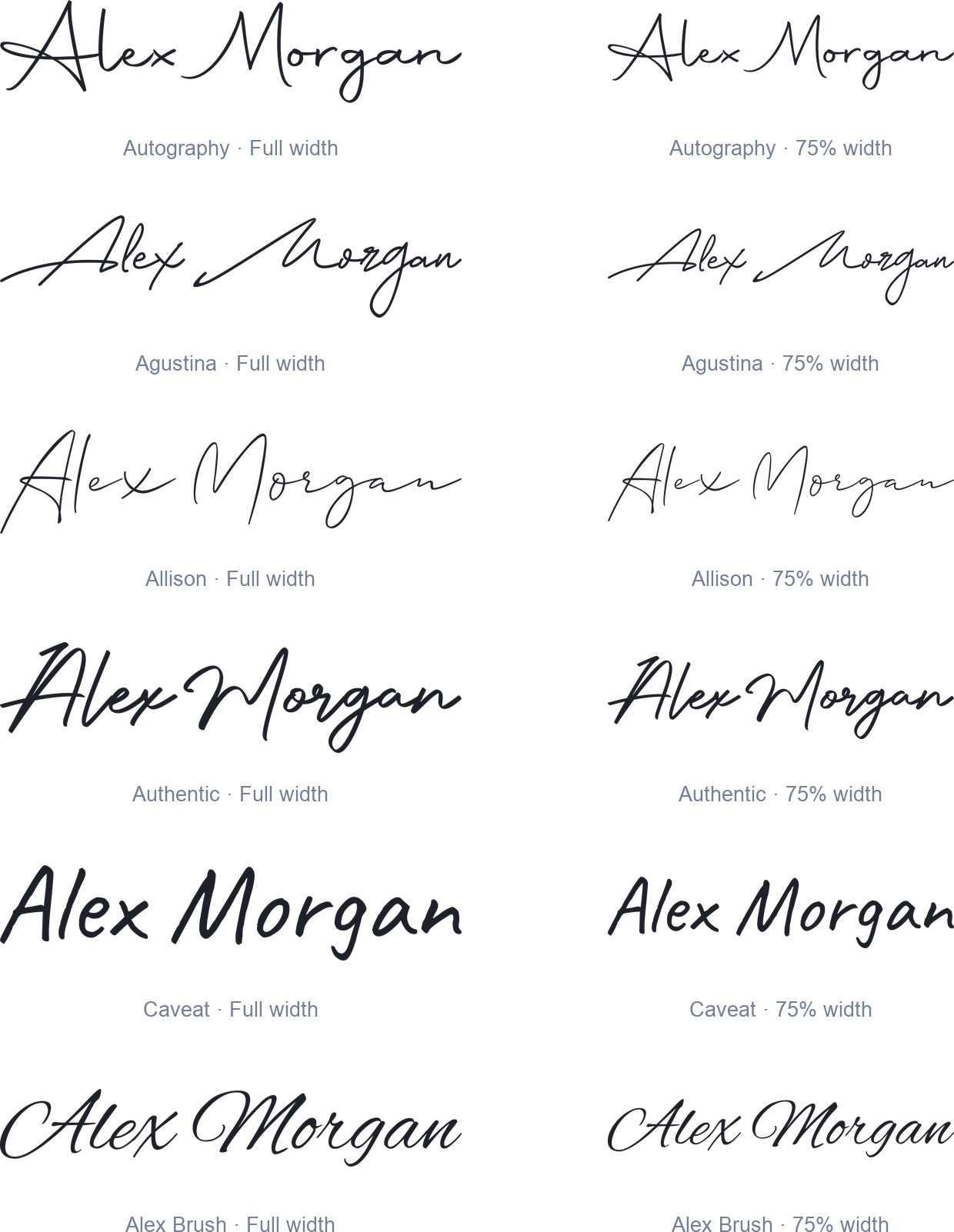
Autography keeps a clear gap between the words, but its small e and o deserve a close look. Agustina spends a large part of its silhouette on the leading A stroke, the tall M, and the descending g; judge the letters between those landmarks. Allison has fine strokes throughout, so inspect the short letters rather than using its tall A as your only size reference. Authentic keeps more stroke weight, but its compact joins still need inspection. Caveat gives the lowercase letters more prominence without long flourishes. Alex Brush retains substantial downstrokes; check its finer connecting strokes and the initial loop at the smaller width.
If a reduced candidate becomes difficult to read, first compare another font at the same width. Increasing every signature element to accommodate one flourish can make the whole email footer feel oversized. Once you have a finalist, check it beside ordinary contact text in a received message. These generated examples establish the visual differences; they do not establish performance in a particular email client.
Create the lettering step by step
For a name-based sign-off, you can also use our Signature Generator. Type your name to explore handwritten fonts, or switch to Draw to write it yourself with a mouse, finger, or stylus. Download a transparent PNG for your email signature, then check it at the size readers will see. The steps below use the Calligraphy Text Generator to walk through the font-based approach.
Enter only the words you want as an image
Open the Free Calligraphy Text Generator and enter your name or a short phrase such as “Best regards.” The tool accepts up to three lines with up to 35 characters per line. For a conventional email signature, start with one line and keep the other contact information in the email editor.
Use the capitalization you intend to keep. Initial capitals and lowercase letters often produce a different rhythm from a name set entirely in capitals. Include any hyphen, apostrophe, accent, or middle initial that belongs in the final version, and check its appearance before committing to a font.
Generate a style group and compare the results
Choose a style group using the Style control, then select Generate. The tool produces font previews for that group, so you can compare your own wording rather than guessing from the group’s sample image. Open a promising preview to inspect the full result and its font name.
The Signature group is a useful place to begin for a name. Other groups may offer a better fit for your visual identity, but changing the group is only helpful if it produces a more legible or more appropriate result. Keep two or three finalists and compare them using the same text and color.
Set the color and turn off the background
A dark neutral is a practical starting point for a signature shown on a light email background. Switch Back off to make the background transparent. This avoids baking a white rectangle into the image when you place it on another background.
Transparency does not automatically make dark lettering readable in every dark-mode email. The text color still matters. Check a light and a dark viewing environment; if the name becomes difficult to see, simplify the design or test the tool’s stroke option. An outline can alter delicate letterforms, so judge the new result at its final size before adopting it.
Adjust the composition before exporting
The generator includes size, alignment, line height, text color, and stroke controls. For a single-line name, size and font choice usually matter more than line height. For a two-line sign-off, use the alignment and line-height settings to keep the lines visually connected without letting loops collide.
Do not assume that the number in the Size control is the width of the downloaded image. Different fonts create different shapes and dimensions from the same setting. The width you choose later in the email editor is a separate decision.
Export a PNG for the email
Open the selected result and choose Download PNG. Keep that original file so you can reuse it without extracting a compressed copy from an old email. The preview also offers SVG export, which can be useful for other design work, but PNG is the practical starting point for inserting this lettering as an email image.
If you are unsure whether you need an image or decorative text that can be pasted into a text field, read Fancy Text vs. Font Images: Which Should You Use? The distinction matters here: copying a calligraphy image does not turn it into editable script text.
Size the signature for the message
Start by displaying a single-line name at roughly 180–280 pixels wide, then adjust it to suit the length of the name and the surrounding text. This is a design starting point, not a Gmail requirement. A short name may need less space, while an elaborate name may need a simpler font rather than a wider signature.
The same generated Autography image is shown below at two display widths. Its design has not changed; the amount of space available to read its smaller details has. This is the comparison to make before choosing your final width.
Avoid enlarging a small bitmap beyond the detail it contains. If your source looks soft, return to the generator and create a larger version, then reduce its display size in the email editor. Keep the aspect ratio intact so the name does not become stretched or compressed.
Put the image into an email signature
Gmail on a computer supports images in its signature editor, as described in Google’s signature instructions. Add your generated image in the Signature section of settings, place the contact text around it, set the appropriate signature defaults, and save the changes.
Keep the name close to the supporting details so the image feels like part of one contact block. A simple arrangement is the lettering followed by an ordinary-text name, role, and one useful link. Repeating the name in ordinary text is especially useful when the image is unavailable or difficult to interpret.
For another email service, use its own current instructions for inserting an image. An image file that works in one editor does not prove that every mobile signature editor has the same controls. Send a message to a test inbox and inspect the received email, not just the editor preview.
Where this style works well
Everyday professional correspondence
A restrained handwritten name can add personality to messages from a consultant, designer, photographer, or other individual professional. Keep the image smaller than the main message content and let the job title and contact details do the practical work. The reader should be able to identify the sender without scrolling through a large signature block.
Personal newsletters
A short handwritten sign-off can work below a personal update or editorial newsletter. It helps mark the transition from the main content to the author’s closing note. If the image says “Warm regards” rather than the author’s name, include the name in ordinary text directly below it so the attribution remains clear.
Client introductions and follow-ups
For a first introduction or a proposal follow-up, use the same lettering you use elsewhere in your correspondence. Consistency is more useful than changing fonts to match every message. Keep any booking or portfolio link as a clearly labeled text link rather than embedding all the information into the image.
Common problems and practical fixes
| Problem | What to check | What to try |
|---|---|---|
| The signature looks blurry | Source dimensions and display width | Generate a larger original and display it smaller |
| Fine strokes disappear | Font choice and final size | Choose a sturdier font or increase the display size |
| A white box surrounds the name | Background setting in the exported image | Switch Back off and generate again |
| The name is hard to see in dark mode | Actual received message | Test another color or a restrained stroke |
| Contact details cannot be copied | Whether they are part of the image | Move them into ordinary text |
| The image does not appear | Email editor and image source | Reinsert it and follow the provider’s troubleshooting steps |
For Gmail-specific image problems, Google’s troubleshooting guide is a better starting point than repeatedly exporting the same image. A display issue may be caused by how the image was inserted or made available rather than by its lettering.
Final signature review checklist
| Check | Ready when |
|---|---|
| Wording | Name, punctuation, and capitalization are correct |
| Readability | Someone unfamiliar with the name can read it at the final size |
| Background | The exported file has the intended transparency |
| Proportions | The image is not stretched |
| Contact information | Important details remain available as ordinary text |
| Delivery | A received test email shows the intended result |
Conclusion
A useful calligraphy email signature starts with a readable name, a font that suits the sender, and a compact transparent PNG. Compare a few real previews, judge the lettering at its display size, and keep contact details outside the image. The final test is a received email in the viewing conditions your readers actually use.
Frequently asked questions
Can I create the signature without drawing it?
Yes. Enter your name in the generator and compare the font-based results. You are creating a handwritten-style image using an existing typeface; you do not need to draw or upload a handwritten sample.
Should I use PNG or SVG in an email signature?
Use PNG as your starting point for an email image. Keep an SVG copy if you also need the lettering for design work, but check the destination’s supported formats before trying to insert it.
Does a transparent background guarantee dark-mode compatibility?
No. Transparency removes the fixed background color, but the lettering still has a color of its own. Test the received email in both light and dark environments before deciding whether the design needs adjustment.
Can I put my whole contact block into the image?
You can create short multiline lettering, but ordinary text is more practical for phone numbers, addresses, and links. Keep those details readable and selectable instead of making the reader extract them from a decorative image.
Do recipients need to install the font?
Recipients viewing the PNG do not need the font installed because its letterforms are already part of the image. The image itself still needs to load successfully in their email application.
What if my name is too long?
Try a simpler font, a modestly larger display width, or an intentional line break. The generator allows three lines of up to 35 characters each. Do not shrink a long name until its smallest details disappear.
Is this a copy-and-paste cursive font?
The calligraphy result is an image. If you need decorative characters inside a text-only field, use the Free Fancy Font Generator and test the pasted text in that destination.