How to make a readable monogram
A wedding invitation, a tattoo reference, and a tiny avatar need different monograms. Compare fonts, explore real uses, and learn which details to keep.
Two initials can look elegant on their own and become impossible to read when pushed together. A decorative font can turn a simple pair into a distinctive mark, but its loops can also hide the second letter. The useful question is not how much detail you can add. It is whether the initials still make sense at the size you will use them.
This guide uses the monogram maker to build personal and wedding initials, adjust their overlap, and prepare artwork for invitations, labels, and digital layouts. Start with your own letters or one of the 72 ready-made designs, then refine the composition in the live preview.
Start with the destination
A monogram on a welcome sign has room for long strokes and small details. The same design on a gift tag may need shorter flourishes and a lighter frame. Decide where the mark is going before choosing the most elaborate font.
For a wedding invitation, leave space for names, a date, and practical information around the monogram. For a bookplate, a compact vertical arrangement may fit better. For a profile image, check the design as a small thumbnail before calling it finished.
The editor exports a square composition. Keep the important letters and decorations inside that square, especially after dragging an element toward an edge. Room in the editing preview is not a reason to place artwork beyond the exported canvas.
Give the initials a clear order
For a personal design, decide which letters you want to represent. The editor accepts one to three A–Z initials. With three letters, the Center layout gives the middle position more emphasis, so enter the initials in the order you want people to see them.
For a couple, a pair of first-name initials is a useful starting point. You can also build a composition around a shared surname initial if that fits the names you use. Make that decision before styling the letters, rather than letting a template choose it for you.
Choose a layout for the shape you need
Classic keeps the initials in a row. Center emphasizes a central initial, while Stacked creates a taller composition. Interlock starts the letters closer together. These are starting arrangements; you can select each letter and move it afterward.
Split combines a large initial with a name through its middle. Underline places a name below the initials with a dividing line. The Name field stays visible but is disabled in layouts that do not use it.
Find character without losing the letters
Open Font and compare the actual initials rather than the font name alone. A wide M, an open C, and a narrow I create different spacing problems. A pair that looks balanced in a serif may need different positions in a flowing wedding script.
Flourish, handwritten, and wedding lettering can work well for softly overlapping initials. Classic serif fonts give the mark a more structured shape. Manga, comics, gothic, and holiday styles offer other directions for a personal mark or an event theme. Decorative categories still need the same small-size readability check.
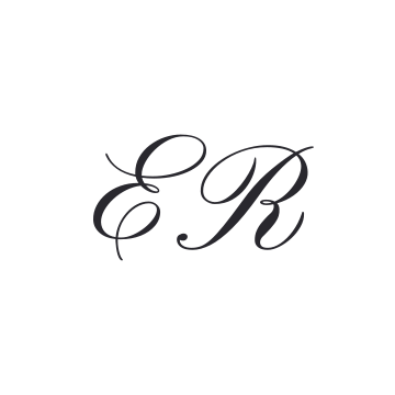
A good comparison changes one major decision at a time. Try the font, then the positions, then the frame. If you change all three together, it becomes harder to tell what improved the result.
Compare fonts by the work their letters do
A font category is a starting point, not a finished composition. Two scripts can behave very differently: one has a long entrance stroke that joins its neighbor naturally, while another has loops on both sides and needs generous space. Compare the same initials in several fonts before committing to a layout.
Baskerville gives capitals a clear structure and a contrast between thick and thin strokes. It is a useful first version for stationery, bookplates, and a personal mark. Palatino feels broader and softer; a wide pair may need smaller letters or a vertical arrangement. Neither needs a frame to look intentional.
Pinyon Script and Bickham Script One bring more formal curves. Try them for wedding initials with a restrained overlap at an outer flourish. Keep the main stems apart. If the decorative stroke of the first letter crosses the identifying part of the second, changing the position usually helps more than adding clearance.
Parisienne and Dancing Script offer a more informal direction. Their uneven rhythm can suit a relaxed celebration or a handmade gift. Do not force both initials to have identical visual width: a narrow letter beside a broad one may need a size adjustment even when their numeric sizes match.
Inter and Space Mono make a useful comparison with those scripts. Inter favors a clean outline, while Space Mono brings a regular, mechanical rhythm. These are good candidates for compact personal marks when ornament is less important than immediate recognition.
| Font direction | Examples to try in Font | A useful starting composition | What to watch |
|---|---|---|---|
| Classic serif | Baskerville, Palatino | Two initials in Classic, without a frame | Thin details at small sizes |
| Formal script | Pinyon Script, Bickham Script One | Interlock with a small intersection | Loops hiding the second initial |
| Relaxed handwriting | Parisienne, Dancing Script | A loose pair or Underline with a name | Uneven visual weight between capitals |
| Clean and compact | Inter, Space Mono | Classic or Center | A plain arrangement that needs better proportions |
| Gothic | Olde English, Germanica Kanzlei | Separated initials or Stacked | Dense vertical strokes merging together |
| Playful display | Anime Ace, Almost Japanese Comic | A clear pair with little overlap | Details competing with a decorative frame |
These are directions to test, not rankings. Try the letters in your name: an attractive sample made with ER may behave very differently with MW. The library includes wedding, flourish, handwriting, comics, manga, and holiday collections, so there is room to move beyond a traditional formal monogram.
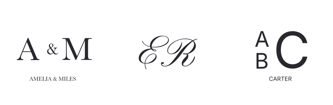
Choose a composition before refining individual letters
The library groups 72 designs into three sets of 24: simple lettering without a frame or fill, framed artwork on transparent backgrounds, and designs with a colored fill. Start with the composition you need, then replace its initials and name. A preset loads the complete design, including its font, ink, frame, and element positions.
Couple joins two initials with an ampersand. Seal bends the name along an arc. Crest gives the family initial more weight, while Diamond places three initials in a triangular arrangement. Split cuts a name through one large initial; Banner creates a name band through several letters. These are different starting structures, rather than just different fonts.
Check the smaller name as carefully as the capitals. Decorative fonts can give an ampersand or lowercase letter an unexpected shape. If the name becomes difficult to read, change Font before trying to solve it with size alone.
A wedding monogram that works across the whole day
Imagine initials for an invitation, a menu, a place card, and a welcome sign. The large sign gives you plenty of room, but the place card is the more demanding test. Start with a version that survives the smaller use, then build the larger stationery around it.
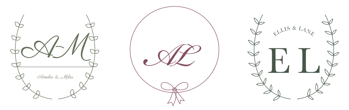
Build a restrained main mark
Try two first-name initials in Pinyon Script or Parisienne, without a frame. Move them together until they read as a pair, but keep both main letter shapes visible. If one initial has a long flourish, let that be the connection instead of pushing both capitals into the same space.
A three-letter monogram needs a deliberate order. If you want a surname initial emphasized in the middle, use Center and enter the letters in the order they should appear. For couples using different surnames, two first-name initials can avoid forcing the design into a shared-surname convention. Choose an arrangement that reflects the names you actually use.
Make a small version and a dressed-up version
Keep an unframed version for narrow menus and place cards. For an invitation cover, try a laurel wreath, ribbon oval, or fine cartouche around the same letters. Reduce the frame’s line thickness when its details start competing with the initials. Keep the font, ink, and overall relationship between the initials consistent so the two versions still belong together.
The monogram is a decorative anchor; the date, venue, and guest information need their own clear typography. Our wedding invitation font guide looks at how to pair decorative lettering with readable supporting text. For table numbers and signs viewed across a room, use the separate advice in wedding table sign fonts.
Check color on the intended stationery
Try a dark muted ink on a light background before experimenting with pale colors. A dusty rose that looks distinct on a large screen preview may feel too quiet on a tiny label. Export with Fill off when the stationery already provides the background color; keep Fill on when you deliberately want a colored square behind the mark.
The editor creates the monogram artwork, not a complete invitation layout. Place the exported file into your stationery document and check the spacing around it there. A balanced monogram can still feel crowded when it sits too close to a heading or paper edge.
Initials for a tattoo reference
A tattoo concept asks a different question from an invitation. Instead of choosing the most elaborate pair, explore which letter shapes communicate the initials with the fewest competing strokes. Make a clear reference that a lettering artist can interpret and adapt.
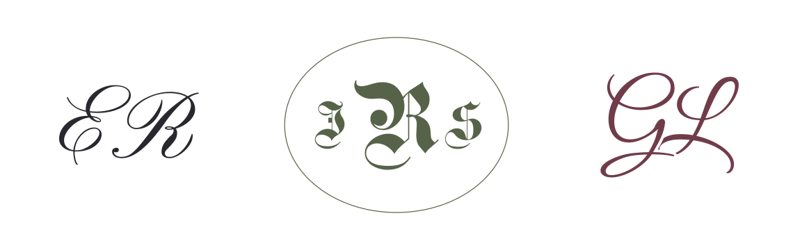
Compare three genuinely different approaches
Try a serif pair with no overlap, a simple handwritten pair with one small intersection, and a stacked arrangement. Keep the ink dark and turn Fill off. Compare the silhouettes before adding a frame. A wide pair may feel natural in a horizontal placement, while manually stacking the letters produces a narrower composition without squeezing the capitals together.
For a gothic direction, start with generous separation. The repeated upright strokes are already visually dense; heavy overlap can turn two initials into a shape that no longer reads as either. With a script, preserve the small openings inside the letters and the space where one flourish passes another.
Tattoo artist Milly’s guide to tattoo lettering emphasizes spacing, scale, placement, and checking the composition before the stencil. Use your exported monogram to discuss those choices with your artist, rather than treating a screen preview as a ready-to-tattoo specification.
Bring alternatives, not just one tiny image
Export your preferred design and a simpler alternative with less overlap. Show the artist which parts matter to you: the initial order, a particular capital shape, or the connection between the letters. Leave room for them to adjust the drawing for the intended placement.
For a full name or a short phrase around the initials, explore the tattoo font generator. Keep that wording separate from the compact monogram while you compare styles; trying to make initials, a name, a date, and a border equally prominent usually makes the design harder to judge.
A personal mark for a portfolio, avatar, or email
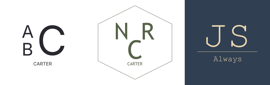
A personal monogram often needs to work without a surrounding explanation. Start with two unmistakable initials in Baskerville, Inter, or a restrained handwritten font. View the design as a small square, then ask someone unfamiliar with it which letters they see.
Design for the smallest appearance
For an avatar, center the visual weight and leave room around the outside. A long calligraphic entrance stroke can make an otherwise centered pair feel off balance. Move the letters as a composition, rather than centering their bounding boxes at the expense of the visible ink.
Keep a simple version for small uses and a more expressive version for a portfolio cover. If a frame becomes an extra ring around a circular profile crop, remove it. If a name is unreadable beneath the initials, reserve the Underline version for a larger heading.
For an email footer, the monogram can sit beside live text containing your name and contact details. Do not make the image carry information that should remain readable and selectable. Our calligraphy email signature guide explains how to place decorative lettering into that wider layout.
A monogram made from a shared font is not automatically a unique brand identity. Treat it as a starting point and check the font’s license before commercial use. The logo font generator is useful if you want to compare a full wordmark with an initials-only mark.
Bookplates, gift tags, and embroidered initials
The same family initials can take several forms. A bookplate has room for a name and a frame. A small gift tag needs a simpler composition. Embroidery introduces a different material and production process altogether.

Give a bookplate a clear hierarchy
Try Split with a large initial and a short family name, or Underline with two initials above the name. Keep the name visibly smaller than the capitals. A rounded frame can bring the pieces together, but it should not crowd the first or last letter of the name.
Print a test at the actual size before making a sheet of labels. A large on-screen view hides how small the name becomes after placement. Our printable calligraphy guide covers the next step of moving lettering into a printable document.
Simplify before sending artwork for stitching
For a robe, towel, or bag, begin with a version that has clear gaps and few fine flourishes. Compare a serif with a simpler script rather than assuming the most decorative wedding font will translate best into thread.
Printful’s embroidery preparation guide explains that small text and fine details may need enlargement or simplification during digitization. Ask the producer to check the artwork for the chosen product. The monogram maker exports artwork, not a stitch file, and the producer’s requirements should guide the final design.
For a stamp or engraved gift, make the same distinction between the visual idea and production preparation. Send the unframed and framed versions if you are undecided, and let the maker check which details can be reproduced at the intended size.
A playful monogram for a different kind of occasion
Not every set of initials needs a wedding script. Anime Ace, comic lettering, a brush font, or a holiday face can make a more fitting mark for a sketchbook, gaming profile, birthday label, or seasonal gift.

Let the font do most of the expressive work. If the letters already have a strong outline or decorative interior, start without a frame and avoid overlap. Two clearly separated comic capitals often communicate more than the same pair buried inside an ornate border.
Try one unexpected direction alongside a conventional one. A clean sans-serif and a manga-inspired display font may lead to very different designs from the same initials. For matching headings beyond the monogram, explore the manga and anime generator or the comic font generator.
A downloaded monogram is an image, not decorative characters you can paste into a username. If you need copyable lettering instead, our explanation of fancy text versus font images helps you choose the appropriate tool.
Use overlap sparingly
Bring the letters close enough to feel connected, but leave their identifying strokes visible. Start with a small intersection at a flourish or edge. If both letters collapse into one dark shape, move them apart before changing anything else.
Select a letter in the preview to show its controls. Drag it into place, then use X and Y for precise positioning. With the preview focused, arrow keys move the selected element by one canvas unit; Shift with an arrow moves it by ten. Size and Angle let you balance a heavy capital against a lighter one without changing the entire design.
What Gap actually changes
Gap is in the Canvas popover. It adds clearance around the parts of an earlier initial that cover a later initial. It does not move the letter centers apart or change the spacing of the whole row.
Try a small value after the positions are already working. Too much clearance can cut important strokes out of the letter underneath. If a letter looks broken, reduce Gap or move the letters until their main strokes no longer collide.
The editor uses a consistent overlap order: earlier initials cover later ones. It does not automatically weave strokes alternately over and under each other. Choose positions that work with that order.
Make each adjustment serve the composition
The lower toolbar acts on the selected element. Click a letter, the name, a frame, or the divider before changing its values. Click empty space to clear the selection; the lower controls then become inactive.
| What you see | What to adjust | Refined example |
|---|---|---|
| Letters merge into one shape | Move them apart first, then add a little Gap at intersections | 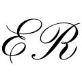 |
| One initial dominates | Select that letter and reduce Size | 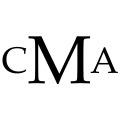 |
| The name competes with the initials | Select the name and reduce Size or move it | 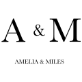 |
| The frame feels heavy | Select the frame and reduce Size, which controls its thickness |  |
| A white box appears around the artwork | Turn Fill off before exporting | 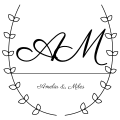 |
| Fine details disappear at small sizes | Choose simpler lettering and review at the intended size | 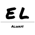 |
On desktop, use Undo and Redo while comparing alternatives. A ready-made gallery preset changes the whole design, including the initials and name. Apply the preset first and then enter your text; Undo can take you back if it is the wrong direction.
Add a name without making it compete
Try Seal for a name set on an arc, Couple for initials joined by an ampersand, or Crest for smaller initials beside a tall family initial. Use Split when the name should cut across a large initial. Use Underline when you want the initials to remain intact above a separate name. Select the name directly to change its size, position, and rotation.
A short name can sit close to the initials. A longer name usually needs more space or a smaller size. Check the smallest letters rather than judging only the outline of the composition. The name shares the artwork’s font and ink color, so choose a font that works for both the capitals and the smaller text.
In Underline, the dividing line is also selectable. Move or rotate it and use Size to change its thickness. Keep it quiet enough that it separates the two text areas without becoming the strongest part of the design.
Give the frame and background a purpose
Open Frame beside Canvas to choose from 23 borders and ornaments, including geometric shapes, botanical wreaths, branches, bows, and crests. Select the frame in the preview to move or rotate it. Size controls stroke thickness; drag the side or bottom handle to change one dimension, or the corner handle to resize proportionally.
A frame is most useful when it brings an uneven composition together. If it crowds the lettering, reduce the letters or choose a shape with more room in the direction you need. Choose the first No frame option to compare the same lettering without a border.

Canvas groups Fill and Gap; Frame has its own popover. Fill controls the background. Turn it on to choose a swatch or a custom color through the browser’s picker. Turn it off for transparent artwork. Ink changes the color of the lettering and decorations together.
Pale lettering may look attractive on a dark background but disappear when exported without that background and placed on a white page. Check the monogram on its intended surface, not just inside the editor.
Export for the next step
PNG for placing an image
Download PNG produces a 1200 × 1200 image. Use it in an application that accepts image uploads, or use Copy to put the PNG on a supported clipboard. If copying is unavailable in your browser, download the file instead.
Keep Fill off when the monogram should sit over a photograph, colored invitation, or existing layout. PNG is a fixed-resolution image, so inspect it at the size at which you intend to display or print it.
SVG for scalable outlines
SVG stores the lettering as outlines, so the recipient does not need the font installed to see the letter shapes. It is useful when the artwork needs to be resized in a compatible design application.
Open the exported file in that application before production. Overlapping letters use masks, and not every cutting or editing workflow handles them in the same way. An embroidery machine also needs a stitch file prepared for the material; the exported artwork is a starting point for that separate process.
For placing the finished mark into stationery, see our guide to printable calligraphy. For the names and headings around a wedding monogram, compare the wedding text generator.
Check the small version before finishing
Look at the monogram as a thumbnail and at its intended final size. Can you still identify each initial? Is the name readable? Does the frame help, or does it fill the gaps that the letters need?
Try one version with less overlap and one with fewer decorations. Keep the one that communicates the initials most clearly. You can return to the monogram maker to adjust the composition, switch Fill off, and export the final version.
Monogram design questions
Do monogram letters have to overlap?
No. Equal-sized initials, a larger central letter, and stacked arrangements can all work. Overlap is one design choice, not a requirement.
Does Gap move the initials apart?
No. Gap adds clearance where one initial covers another. Drag a letter or change X and Y to change its position.
Can I change the name separately?
Yes. In Split and Underline, select the name in the preview to adjust its size, angle, and position. The font and ink color apply to the artwork together.
Which format keeps a transparent background?
Turn Fill off before exporting. PNG and SVG can preserve the transparent background; check the result in the application where you place it.
Will choosing a preset keep my initials?
A gallery preset replaces the whole design, including its initials and name. Apply it first, then enter your text. Undo restores the previous design.