How to create a handwritten signature
From an email sign-off to an artist’s mark: explore eight ways to use your handwriting, choose a pen, and refine a signature that stays recognizable at any size.
A handwritten signature needs a recognizable rhythm more than an elaborate flourish. One distinctive capital, a consistent slant, and a clear ending can do more than several loops squeezed around an unreadable name.
With the Signature Generator, you can draw that rhythm yourself and refine it afterward. The editor keeps the drawn strokes, so changing the pen, size, ink color, or pen settings updates the existing signature. You do not have to rewrite your name every time you want to compare a different finish.
This guide focuses on Draw mode: how to choose a pen, make useful adjustments, and export an image that stays readable in its final layout. Type mode is also available when you want a font-based name rather than your own handwriting.
Decide where the signature will appear
An artwork credit, an email sign-off, and a large certificate have different space constraints. Decide on the placement before making your strokes more elaborate.
For an email, small loops and extremely thin hairlines may disappear after the image is reduced. A certificate can accommodate more contrast and a longer finishing stroke. An artist's mark may work better as initials if a full name overwhelms the composition.
| Use | A useful direction | Check at the final size |
|---|---|---|
| Email sign-off | A restrained full name | The thin strokes remain visible |
| Artwork credit | A compact name or initials | The mark does not compete with the artwork |
| Certificate or invitation | A contrasting nib style | Capitals and flourishes stay separate |
| Personal branding | A repeatable, recognizable shape | The design survives both large and small placements |
For initials combined into a structured emblem, use the Monogram Maker instead. Our monogram guide explains layouts and frames; a drawn signature is better when the personal movement of the line is the point.
Eight ways to use a handwritten signature
The same signature does not need to look identical everywhere. Keep the recognizable letter shapes, then adapt the weight, length, and amount of decoration to the space. The layout examples place drawings from our signature engine into sample designs; the illustrated painting separately shows how a small artist’s mark can sit within an artwork.
1. An email sign-off that still feels personal
A signature beneath a short message can make the ending feel less mechanical. Its job is to add a personal touch, not to become a second headline. Start with a restrained full name and leave your role, contact details, and links in ordinary text below it.
Try Pen for an even line, or Fine nib with enough weight in the thin strokes. A long flourish that looks graceful on the drawing canvas may force the entire signature to shrink inside an email. Shorten that flourish before making the lettering smaller.
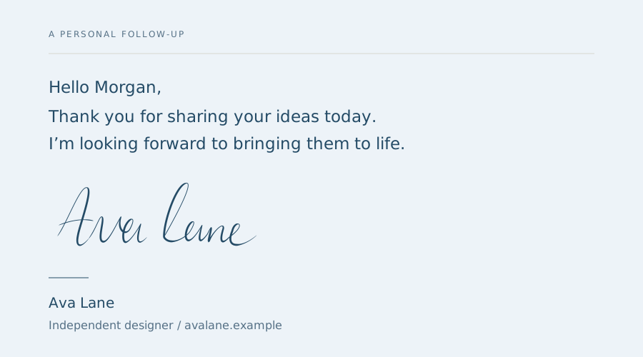
Export a transparent PNG and place it at a modest width in the email signature editor. Send yourself a test and read it on a phone. If the name disappears while the contact details remain readable, increase the stroke weight or simplify the drawing. Our email signature guide covers the placement workflow in more detail.
2. An artist's mark that leaves the artwork in charge
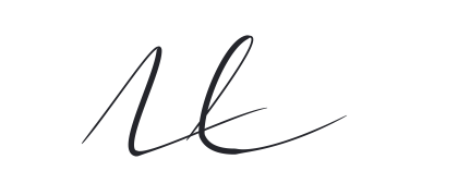
For an illustration or a print, a compact pair of initials can be more effective than a full name. Choose a quiet area of the composition and keep a comfortable margin from the edge. The mark should be discoverable without becoming the first thing someone sees.
Draw the initials as a deliberate small composition: perhaps one taller capital and one shorter connecting stroke. Compare Fine nib and Ruling pen. The latter can add character, but too much texture will look untidy once reduced.
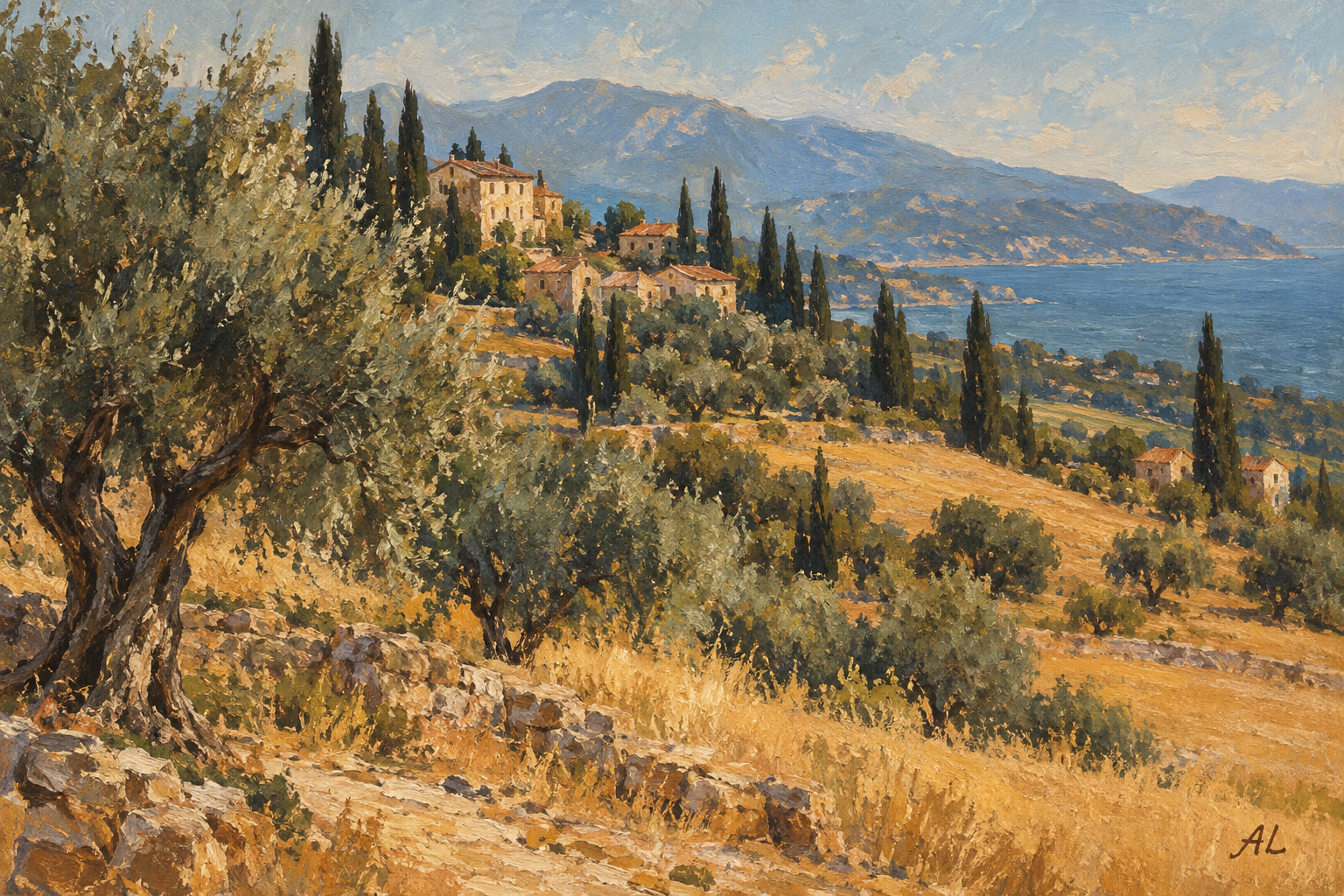
Place the exported image in your artwork editor; the signature generator does not add it to an illustration for you. Compare a small and a slightly larger placement before choosing. If the initials need to function as a formal emblem with a frame or a fixed arrangement, consider a monogram instead.
3. A portfolio sign-off with a recognizable silhouette
A portfolio can use a signature in an introduction, an about section, or the ending of a project story. Here, the shape matters as much as the literal name: a distinctive capital or a long baseline can echo the character of the work.
Avoid using the signature at every turn. A decorative name above every project can make a carefully edited portfolio feel repetitive. Use it once where a personal voice helps, and keep navigation and project titles in readable text.
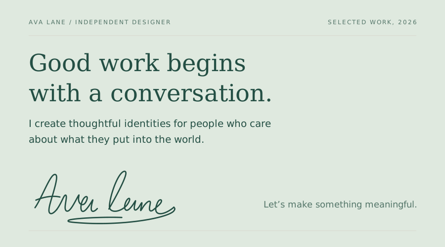
Try an even Pen line for a minimal portfolio and Brush for a more expressive one. Review the signature beside your actual heading font. Two highly decorative styles placed together can compete; a quiet surrounding layout gives the handwritten element more presence.
4. A certificate with a clear signing area
A workshop certificate or a personal award has a different hierarchy from an email. The recipient's name and achievement should lead; the signature identifies the person presenting it. Leave enough space between the signature and the role printed underneath.
Fine nib can work well here because the contrasting strokes give the name a formal rhythm. Keep the broad strokes open enough that adjacent letters do not merge. If a flourish crosses the printed role or the signing line, move the signature in the layout rather than shrinking everything.
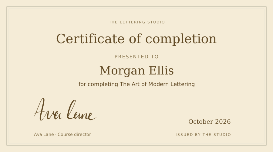
Use SVG in a layout application that supports it, or a suitably sized PNG. Review a print at the intended paper size: delicate lines that look crisp when zoomed in can become weak on paper. Our printable calligraphy guide discusses matching the exported artwork to its printed placement.
5. Wedding thank-you cards and personal notes
A handwritten sign-off can connect a printed thank-you card to the people sending it. It does not need the same ornament as the invitation heading. A simple name with one distinctive capital can make a short note feel warm without crowding the message.
Draw each name as you would naturally write it. If you want two names in one exported image, draw both in the canvas, leaving an intentional gap. Remember that later style changes affect both names together. For independent colors or separate positioning, export the names separately and arrange them in the card editor.
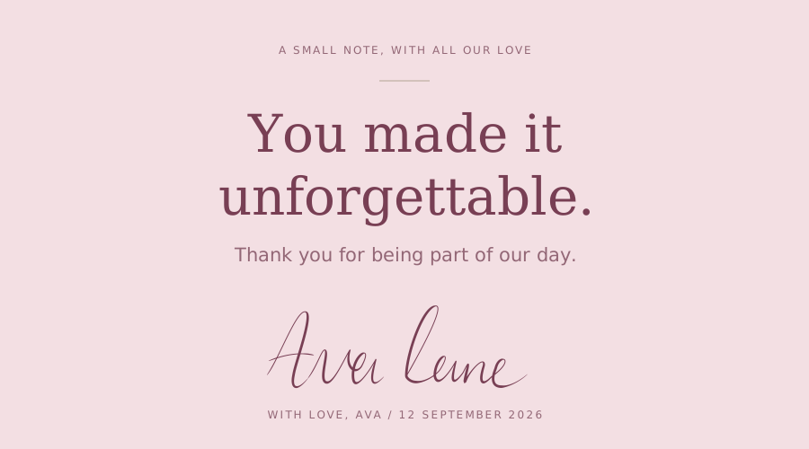
Compare the signature with the invitation's lettering before settling on a pen. If the heading is elaborate, a calmer sign-off often works better. See our wedding calligraphy guide for ways to combine decorative lettering with readable supporting text.
6. Business cards, packaging, and a small personal brand
A signature can become a recurring mark on a maker's card, a product insert, or a packaging label. Choose a version that remains recognizable after reduction. Long hairline flourishes and loose dry-brush texture may suit a large print but disappear on a small label.
Start with Brush for a rounded, substantial mark or Pen for a quieter one. Save two versions: a fuller signature for large placements and a simplified version for small ones. Keep the main capital, overall slant, and ending consistent so they still feel related.
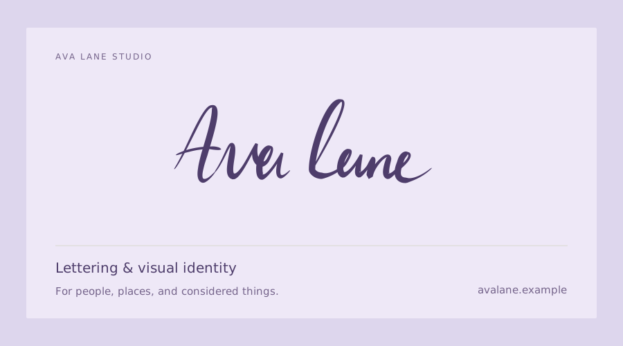
For a type-based wordmark rather than your own handwriting, compare the Logo Font Generator. The distinction is useful: a signature contributes a personal gesture, while a wordmark may prioritize exact spacing and consistent letter construction.
7. A photography credit that survives the background
A signature placed on a photograph has to contend with both light and detail. Find a quiet area first. Thin ink over tree branches, hair, or a patterned fabric may be impossible to read even when the color contrast seems strong.
Prepare a dark version and a light version, then test each on the actual photo in your image editor. Start with simple initials or a short name, and keep the line more solid than you would on white paper. If neither version works, put the credit outside the photograph in a caption instead of forcing it over a busy image.
The generator exports the signature asset; it does not batch-watermark your photographs or protect them from copying. Choose a placement that supports attribution without obscuring the photograph's subject.
8. A personal letter, dedication, or digital journal
For a letter or a dedication, your ordinary handwriting may be more appropriate than the most polished preset. Keep the slightly unusual capital or uneven connection that makes the name yours. Use refinement to remove distracting wobble, not every trace of the way you write.
Try turning Refine handwriting off, then restore it and raise Smoothness only until the long curves feel calmer. If the two versions become indistinguishable from a font sample, you may have smoothed away the detail you wanted to keep.
A dedication often needs just the first name. That gives the line more room and avoids shrinking a full signature into a narrow margin. Export it transparently and leave breathing space around it when you place it beneath the message.
Build a signature around one memorable feature
If every letter has a flourish, no letter gets to lead. Choose one feature to emphasize: a tall opening capital, a distinctive loop, a compact pair of initials, or a finishing stroke. Let the rest of the name support it.
Start with the capital, then check the lowercase letters
Write your opening capital three ways: close to your normal handwriting, slightly taller, and simplified. Follow each with the same lowercase name. The most attractive capital by itself may not be the best fit for the word that follows it.
Check the space after the capital. A large loop can make that gap look empty even when the letters are physically close. Move naturally into the next stroke rather than filling the gap with another decorative line. Redrawing the connection is often more useful than increasing the weight of the whole signature.
Give the finishing stroke a job
A finishing stroke can underline the name, lead the eye out of it, or balance a large first letter. It should not slice through the smaller letters or create a second line that reads as a separate word.
Try the signature with and without the flourish. If the simpler version is clearer at its intended size, keep it. If the flourish helps, shorten it until it fits the composition. Use End taper to refine the ending, but redraw it if the direction itself is wrong.
Test a full name against initials
A long surname is not automatically a problem: a restrained line can carry it elegantly. But in a tiny artwork credit or label, initials may be a better shape. Compare both at the same final width rather than comparing two large previews.
A five-minute refinement exercise
Draw one comfortable version of your name, then keep the drawing unchanged while you compare styles. This separates the effect of the pen from the effect of rewriting the letters.
- Start with Pen. Look only at spacing and letter shapes. If those are unclear, redraw before adding contrast.
- Switch to Fine nib. Set Size so the smallest loops stay open, then adjust Contrast to keep the hairlines visible.
- Compare Refine handwriting on and off. Increase Smoothness only where it helps the longer curves.
- Check the exits of the capitals and the final letter. Adjust End taper if they need a cleaner finish.
- Export the result and place it at the intended size. Compare that view with the large preview before making another change.
Keep a plain version alongside the expressive one. A signature that works beautifully on a certificate may need that simpler companion for email or a small credit line.
Draw your name before perfecting it
Open the generator and choose Draw signature. It starts with Fine nib at size 10, a useful way to see the distinction between thin and thick strokes. Treat that as a starting point, not a prescribed size for every name or device.
Write your name at a comfortable scale inside the drawing area. Leave space for descending letters and a finishing stroke. You can lift the pointer between letters: a convincing signature does not require an uninterrupted line from beginning to end.
Try three versions: your usual signature, a slower readable version, and a simpler version with fewer flourishes. Save any version you want to keep before clearing the canvas. When you compare them, look at the silhouette and spacing first. A pen setting cannot rescue letters that overlap so much that their structure has disappeared.
A mouse often benefits from shorter, deliberate strokes. With a finger, write large enough that your hand does not hide the next turn. A compatible stylus can provide pressure data; a mouse relies on the editor's simulated variation from movement. The same pen preset will therefore not necessarily feel identical across devices.
Choose the pen by its stroke character
The six presets change how the stroke is constructed. Switch between them on an existing drawing to compare the line without changing the handwriting underneath it.
| Pen | What changes visually | A useful starting use |
|---|---|---|
| Pen | A clean, relatively even line | Small signatures and restrained initials |
| Fine nib | Stronger thin-to-thick contrast | Formal signatures with clear hairlines |
| Flat nib | Width depends on the direction of an angled nib | Broad-edged, structured lettering |
| Brush | Rounded, pressure-varying strokes | Looser personal signatures |
| Dry brush | A textured, less solid stroke | Expressive artist marks |
| Ruling pen | An angled, pressure-varying, textured edge | More experimental lettering |
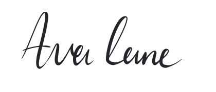
These three drawn examples explore different directions: clear lettering, light connections, and broader brush strokes.
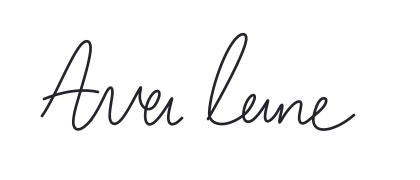
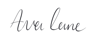
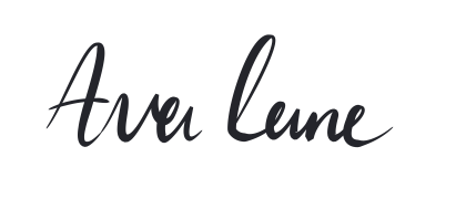
Pick the preset whose basic behavior matches your goal, then refine it. Trying to make a textured brush look like an even technical line is usually more work than starting with Pen.
Adjust size and ink before the finer controls
Size affects the overall weight of the signature. Increasing it can make thin strokes more durable at small output sizes, but it can also close the spaces inside letters such as e, a, and o. Check those spaces after every substantial increase.
The Size slider uses whole-number steps. If you need an intermediate value, type a fraction in the numeric input. Changes apply immediately to the existing drawing; Done closes the popover rather than acting as an Apply button.
Start with dark ink on a light background when judging the line. Once the shape works, try the intended color. Pale ink may look elegant in the editor but disappear when reduced or placed over a photograph. The color popover offers swatches and a custom color picker, and color changes update the drawing immediately.
Refine the path without erasing its character
Open Pen settings and compare the handwriting with Refine handwriting on and off. This is a useful reference point: it lets you distinguish the line you drew from the editor's refinement.
Smoothness changes the path of the handwriting. Increase it when a long curve has distracting small wobbles. Stop when deliberate corners, tight loops, or unusual letter joins begin to look too rounded. A higher setting is not automatically more professional; the goal is to remove accidental noise while keeping intentional shapes.
Flow, available for pressure-using pens, refines simulated pressure for mouse and finger strokes. Recorded stylus pressure is preserved, so this control will not reshape a pressure profile supplied by your pen. It addresses how the weight develops, rather than where the curve goes. If the path looks good but the thick and thin regions feel abrupt, compare Flow while keeping size and contrast unchanged.
Change one control at a time. Move it far enough to understand the effect, then return to a subtler value. If you change Smoothness, Size, and Contrast together, it becomes difficult to tell which adjustment improved the signature.
Shape contrast, taper, and nib angle
The controls below the refinement section depend on the selected pen. A uniform Pen does not need the same controls as a textured, pressure-varying Ruling pen.
Contrast controls the separation between thinner and thicker parts. High contrast can give Fine nib a formal finish, but hairlines need to survive the final display size. If they disappear, lower contrast or increase size slightly before adding more decoration.
Sensitivity changes the pen's response to pressure. With a mouse or finger, movement and the simulated pressure profile influence that response; with a suitable stylus, the recorded pressure matters. If the difference is subtle on a particular stroke, compare a longer curve with more variation in speed or pressure.
Start taper and End taper shape the beginning and ending independently. A pointed exit can soften an abrupt stop. Too much taper on a short stroke can make that stroke look weak, so judge small marks as well as the longest flourish.
Angle, for broad-nib styles, changes the nib orientation. It is not a rotation control for the entire signature. Compare a diagonal stroke and a rounded letter to see how the same angle affects different directions.
Texture, for Dry brush and Ruling pen, changes the roughness of the edge. Use enough to create character, but inspect the exported signature at its final size: rough edges can merge into visual noise when made very small.
Refine your handwritten signature
Use this table when you can see a problem but are unsure which control to try. Start with the first adjustment, then compare the result before moving on.
| What you see | What to adjust | What to preserve |
|---|---|---|
| Long curves look shaky | Increase Smoothness gradually | Deliberate corners and letter joins |
| Stroke weight changes too abruptly | Compare Flow and Sensitivity | A natural difference between light and heavy strokes |
| Thin lines disappear when reduced | Lower Contrast or increase Size | Open spaces inside small letters |
| Stroke endings look blunt | Increase End taper | Enough weight in short strokes |
| Broad strokes lean the wrong way | Adjust the nib Angle | The original slant of your handwriting |
| Rough edges look noisy | Reduce Texture or choose a cleaner pen | The distinctive shape of the signature |
All these style adjustments affect the whole drawing. There is no individual-stroke selection or separate styling layer. If one letter needs a different shape, use drawing edits rather than expecting a global slider to change only that letter.
Know what Undo and Reset change
Undo and Redo are for drawing edits. They let you revise the marks you made; they are not a history of every pen experiment. Switching presets and adjusting style are a separate part of the workflow.
Reset in Pen settings returns the current pen's adjustments and handwriting refinement to their defaults. It does not mean “clear the canvas,” and it is not a saved version of your preferred custom style. Download variations you want to compare outside the editor.
There are no saved custom pen presets or editable project downloads. Keep the page open while experimenting, and export the versions you want before leaving it. An SVG is useful artwork, but importing it back as an editable drawing project is not part of this tool.
Export for the destination
Draw mode exports a cropped signature with a transparent background. Choose PNG for email or software that expects a conventional image. Choose SVG for a compatible layout or vector editor when you need to resize the artwork without relying on a fixed pixel grid.
Check the downloaded file in its destination. A transparent image may look different on a dark page than it did on the white drawing area. Leave a little breathing room around it in the layout, and avoid stretching it out of proportion.
For email, keep your contact details as ordinary text and use the signature image as a small personal accent. Our email calligraphy signature guide covers placement and sizing. For paper layouts, see printable calligraphy and inspect a test print before finalizing the design.
If drawing feels awkward, switch to Type mode and compare a few fonts. That produces a font-rendered name, not a capture of your handwriting, but it may fit a decorative sign-off. The best choice is the one that stays recognizable, readable, and appropriate to the space where you will use it.
Frequently asked questions
Can I change the pen after drawing my signature?
Yes. In Draw mode, switching the pen or changing size, ink color, and pen settings restyles the existing drawing. The changes apply to the whole signature, not a selected stroke.
What is the difference between Smoothness and Flow?
Smoothness refines the path of your handwriting. Flow refines simulated pressure for mouse and finger strokes with pressure-sensitive pen styles; recorded stylus pressure is preserved. If a curve is wobbly, start with Smoothness; if its width feels uneven, compare Flow and the pen’s contrast settings.
Does a mouse support pen pressure?
An ordinary mouse does not provide stylus pressure. The generator can derive variation from movement speed, while a compatible stylus can supply pressure data. The device and drawing gesture affect the result.
Can I use fractional pen sizes?
Yes. The Size slider moves in whole steps, but you can type a fractional value in the numeric field when you need a finer adjustment.
Does Undo reverse a pen change?
Undo and Redo operate on drawing edits. Use Reset in Pen settings to restore the current pen’s adjustment defaults and handwriting refinement defaults. Download versions you want to keep before clearing the drawing or closing the page.
Should I download PNG or SVG?
Use PNG for email and applications that expect a conventional image. Use SVG in software that supports vector artwork when you need to resize it. Draw mode exports a cropped transparent result.
Is Type mode my actual handwriting?
No. Type mode renders your name in a font. Draw mode captures the strokes you make with a mouse, finger, or stylus.