How to Choose Fonts for Wedding Table Signs
Compare fonts, line breaks, wording, and sizes for wedding table signs, with lettering samples and five finished design examples.
A wedding table sign needs to make a short message easy to recognize in a limited space. A script that looks attractive on a large invitation preview can give you tiny lowercase letters on a small card. Before choosing a font, compare the actual wording inside the shape of the sign, then try a different line arrangement before simply reducing the size.
We used the Free Wedding Text Generator to create the lettering in the comparisons below. You can see “Cards & Gifts” in five fonts, compare one line with two, and judge “Table 5” against “Five” in the same card layout. These are generated lettering samples placed in illustrative layouts, with the settings explained so you can reproduce the comparisons with your own words.
Start with the job of the sign
A table number helps guests find a destination. A gift-table sign identifies a place to leave something. A short message beside favors adds personality once the guest is already nearby. Those jobs place different demands on the lettering, even when the cards belong to the same wedding.
Choose the essential words first. For a table number, the number is the information that must stand out. For a gift table, “Cards & Gifts” describes the purpose directly. A phrase such as “With Love” can decorate that area, but by itself it does not tell someone where to put an envelope. Keep an expressive phrase only when the surrounding context or a supporting line makes the action clear.
| Sign | Information that should lead | Useful first comparison |
|---|---|---|
| Table number | The number or table name | “Table 5” against “Five” |
| Gift table | What belongs there | One-line and two-line “Cards & Gifts” |
| Reserved seating | Who the place is reserved for | Short heading with a plain supporting line |
| Guest book | The action to take | Decorative heading with readable instructions |
| Favors | What guests may take | Short phrase with a separate instruction |
Avoid choosing the whole collection from one attractive word. A font that handles “Five” comfortably may make a much longer table name feel crowded. Preview the shortest and longest real labels before committing to a design for every table.
Compare the same phrase in five fonts
The first comparison keeps the wording, text color, and available lettering area fixed. Each generated image is fitted proportionally inside the same wide, shallow area. The images are not stretched to force their letters to the same height or width. That makes the comparison useful for a real layout question: what does this font do with the space available?
All five samples use size 72, line height 1, text color #1E2129, stroke 0, and Back switched off in the generator. The single-line source is left aligned; each finished image is centered in its placement area. The comparison images have transparent backgrounds.

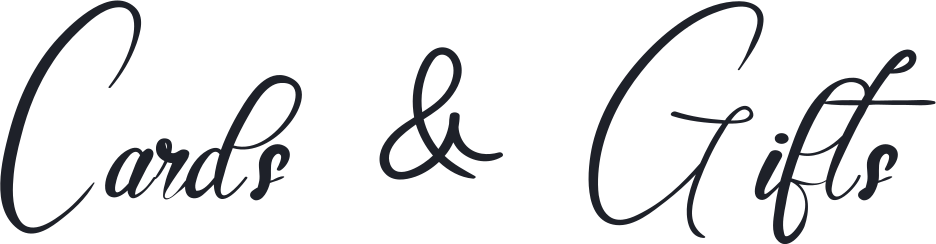



Dancing Script keeps the whole phrase visually active
In this sample, the lowercase letters occupy a substantial part of the line. “Cards” and “Gifts” remain visually present alongside the capitals and ampersand. The phrase has a flowing appearance without making the initial letters the only prominent features.
This is a useful first candidate when you want a handwritten feeling on a short practical label. Inspect the ending of “Gifts,” especially when reducing the card, and leave room below the line for the descending stroke. Treat this as a starting choice for these words, rather than a promise that every phrase will work equally well.
Elegant Wedding gives more of the space to capitals
Elegant Wedding makes the C and G prominent while the lowercase letters sit much smaller beside them. In the same shallow placement area, those tall initials limit how large the complete image can become. The result feels lighter and more delicate, but the actual words occupy less of the available width.
If you like this version, try a taller lettering area before enlarging it into the margins. Judge the small letters as well as the attractive capitals. A design can look spacious overall while still making the information too small for its intended use.
Amellinda Weddings gives the phrase more weight
Amellinda Weddings produces a heavier, rounder line. The lowercase letters have a stronger presence than in the Elegant Wedding example, and the ampersand becomes a substantial shape within the phrase. It is a useful candidate when you want the sign to look bold and informal.
Look closely at the middle and end of “Gifts,” where several strokes sit near one another. More weight does not automatically solve every readability problem. If the phrase looks crowded in your layout, give it more room or compare a less dense font before adding an outline.
Flanella makes the loops and spaces part of the design
Flanella draws “Cards & Gifts” with fine strokes, broad loops, and generous gaps around the ampersand. The capitals feel expansive without the heavy, rounded weight of Amellinda Weddings. Look at the thin connecting lines as well as the silhouette: they are part of the lettering that must survive reduction.
Try it for an airy sign with dark ink and a quiet background. Avoid making both the lettering and the background pale. If the delicate strokes disappear at the intended size, enlarge the heading or choose a stronger font; a decorative frame cannot restore missing letter detail.
Mandala Wedding 2 gives the phrase an upright rhythm
Mandala Wedding 2 has tall, narrow forms and largely separate letters in this sample. It feels closer to a hand-lettered sign than a flowing connected script. The tall ampersand is an important part of the overall height, so compare the complete phrase rather than judging “Cards” alone.
This is a useful alternative when you want a simpler heading while keeping some personality. Test it in a shallow card before committing: upright letters can be narrow without being short. In the Reserved layout below, removing the ampersand produces a different balance, which is why each real label needs its own preview.
| Font in this sample | Visible difference | What to check next |
|---|---|---|
| Dancing Script | Flowing phrase with substantial lowercase letters | Descenders and the end of “Gifts” |
| Elegant Wedding | Large capitals with much smaller lowercase letters | Whether the smaller letters survive reduction |
| Amellinda Weddings | Heavier strokes and a prominent ampersand | Separation between neighboring strokes |
| Flanella | Fine strokes, broad loops, open spacing | Dark ink and enough size for thin lines |
| Mandala Wedding 2 | Upright, separate letters and a tall ampersand | Full phrase and ascender height in a shallow card |
Try two lines before shrinking the lettering
The next comparison uses Dancing Script in two equally sized, portrait-shaped placement areas. Both versions fit inside the same available lettering box. The left card keeps “Cards & Gifts” on one line. The right breaks after “Cards,” uses center alignment, and keeps line height 1 in the generator.

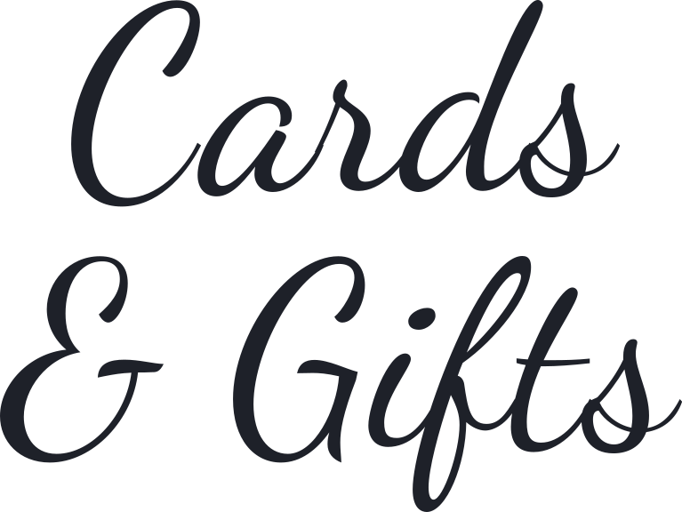
The single line leaves a large amount of unused height. The two-line version uses that height and allows the individual letters to appear larger within the same card width. The improvement comes from changing the arrangement and fitting the new image into the layout; the generator size remains 72 for both versions.
That distinction matters when reproducing the example. Adding a line break alone does not guarantee bigger printed letters. You still need to place the exported image at a suitable size in the card. Preserve its proportions and inspect the top, bottom, and side margins after placement.
For this phrase, keeping “& Gifts” together gives the second line a clear meaning. A three-line version with the ampersand alone would create a different rhythm and use more vertical space. Try that only when it helps your actual card, rather than assuming that more lines always improve a narrow design.
If the lines collide in another font, increase line height and regenerate. If they feel disconnected, compare a smaller line-height setting. Check the finished image after each change because ascenders, descenders, and swashes make the visible gap different from a simple distance between text baselines.
Compare the wording inside the same card
“Table 5” and “Five” identify the same number, but they produce different compositions. Here both are set in Dancing Script and fitted inside equal landscape-shaped placement areas. The wording is the changing variable; the font, color, and card remain the same.

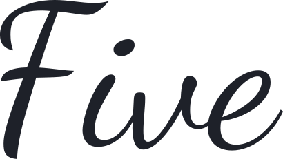
“Table 5” includes an explicit label and a numeral. “Five” is shorter, so it can use more of the available height at the same maximum placement width. Its initial F also becomes an important part of the design. Neither choice is universally better: choose the one that fits how the tables are identified elsewhere.
Keep the seating plan and table cards consistent. If the plan sends someone to “Table 5,” make the corresponding table easy to recognize. Before choosing spelled-out numbers for the whole set, preview longer words such as “Seventeen” in the same layout. One short, successful sample does not establish a workable system for every number.
Use the same reasoning for other wording choices, but preserve meaning. “Reserved” and “Reserved for Family” differ in the information they provide. If the longer phrase is necessary, a plain supporting line may work better than squeezing every word into the decorative heading. “Thank You” is a message; “Cards & Gifts” is a label. Changing between them changes the job of the sign as well as its appearance.
Check the small letters when you reduce the design
This illustration shows the same Elegant Wedding artwork at two display widths. The second version is half the width and half the height of the first. The relationship stays the same even if your browser resizes the whole illustration; the image does not represent a calibrated physical print size.
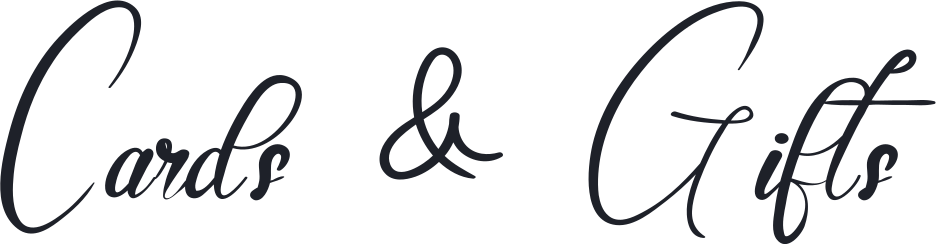
Notice how the capitals remain the obvious landmarks while the small letters become less prominent. Looking only at C and G can give you a false sense that the whole label is large enough. Read “ards” and “ifts” deliberately when judging the reduced version.
For a final sign, place the artwork in a document with the intended card dimensions and print one proof without scaling the page to fit. Put it in the holder you plan to use. Check it from the position where a guest will approach or stand, including whether a clip, frame edge, flowers, or another object obscures the lettering. These screen comparisons help shortlist designs; they do not establish a tested viewing distance or a guarantee about your printer and paper.
Apply the lettering to five table-card layouts
The comparisons above change one variable at a time. These five original layouts show how the chosen lettering can work with supporting type, card proportions, and decoration. We studied the linked Pinterest examples for layout ideas, then made our own compositions using real generator exports. Backgrounds, frames, and supporting text were added separately; these are design examples, not print or cutting templates.
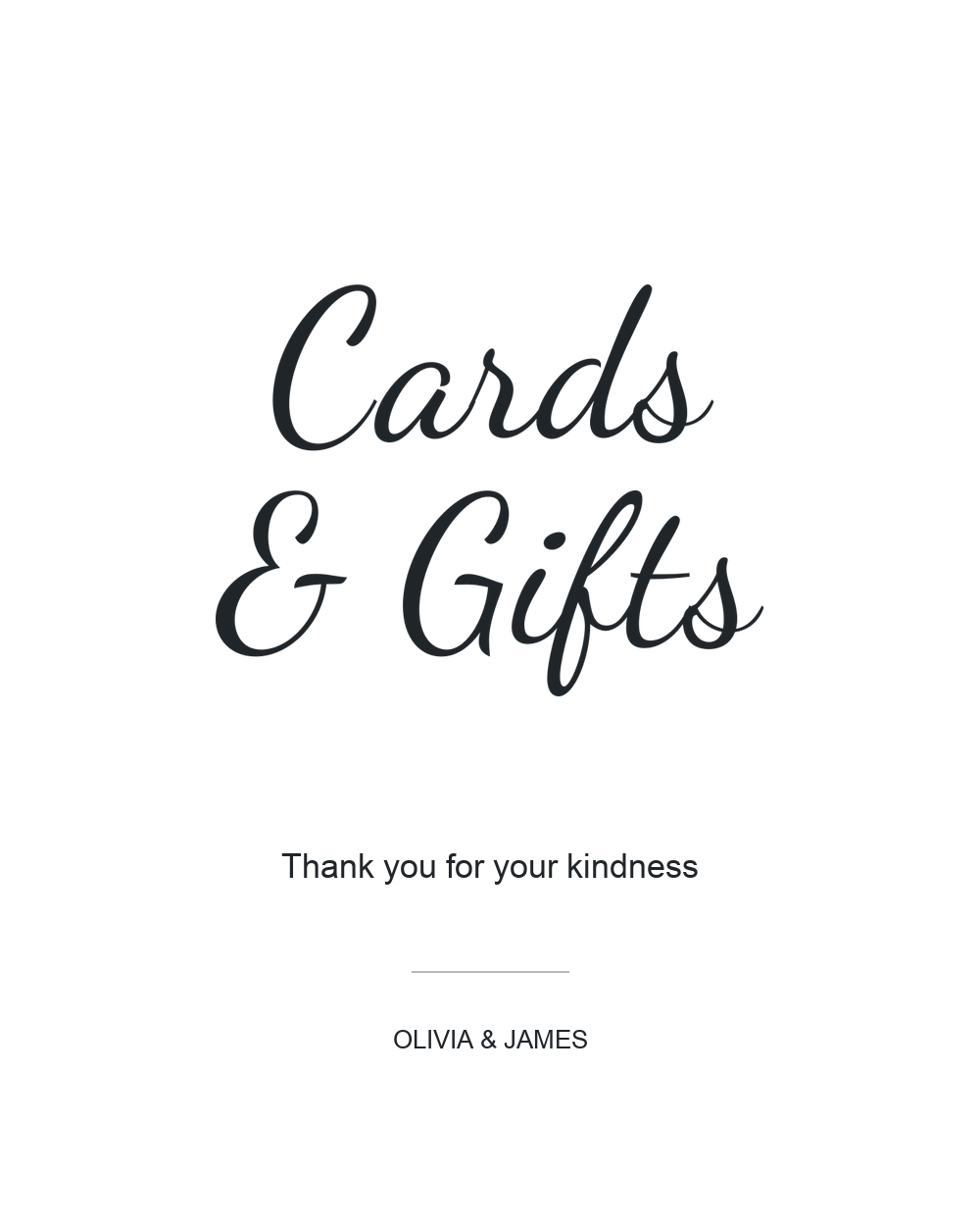
Modern gift-table sign: Dancing Script with Arial
The minimalist Cards & Gifts sign from Oh Happy Printables on Pinterest stacks the words vertically and lets large script strokes reach the sides. The useful lesson is to use the height of a portrait card. Our version keeps “& Gifts” together on the second line and leaves every stroke comfortably inside the edges.
Dancing Script carries the main message; Arial keeps the thank-you line quiet and direct. The larger gap below the lettering separates the label from the courtesy message. A small names line sits lower still. Keep the whole two-line heading centered as one image, and check the descender in “Gifts” before moving the supporting text upward.
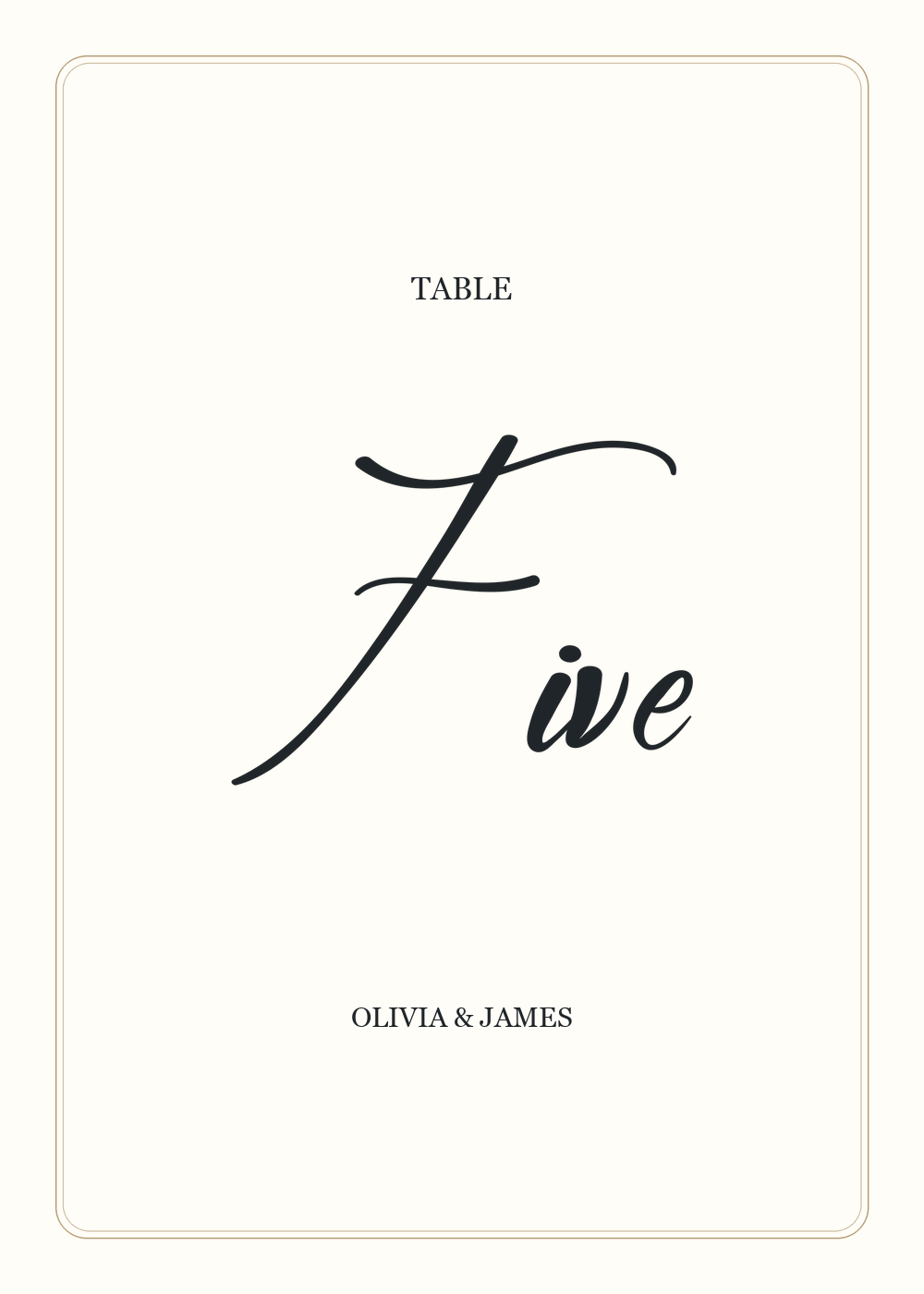
Formal table number: Elegant Wedding with Georgia
The GRD calligraphy table-number card on Pinterest gives the written number a large central field, with a small table label above and names below. Our interpretation uses “Five” in Elegant Wedding, a quiet Georgia label, and a fine double frame in a muted gold color.
The frame stays well away from the large F, while the smaller letters remain the information to inspect closely. The footer has its own space above the lower border. Before using this layout for a full set, replace Five with the longest number word and check it at the same card dimensions. Keep the wording consistent with the seating plan.
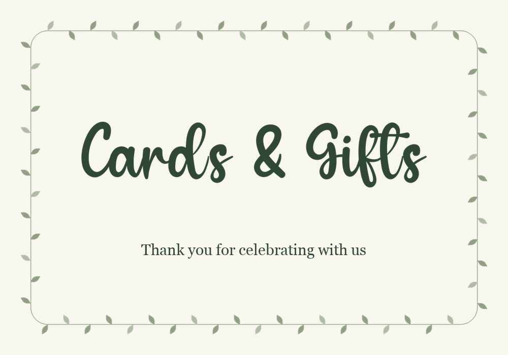
Botanical gift sign: Amellinda Weddings with Georgia
The botanical gold-and-greenery table-number card on Pinterest places foliage around a clear central panel. We applied that separation to a landscape gift sign: a light leaf border stays near the perimeter, while the heavier Amellinda Weddings lettering occupies the open center.
The wider card lets “Cards & Gifts” stay on one line without squeezing the final letters toward the frame. Dark green lettering creates a clear difference from the pale background and lighter leaves. The smaller Georgia thank-you line sits below with a generous gap. Keep all foliage outside the lettering area, including the ampersand and the end of “Gifts.”
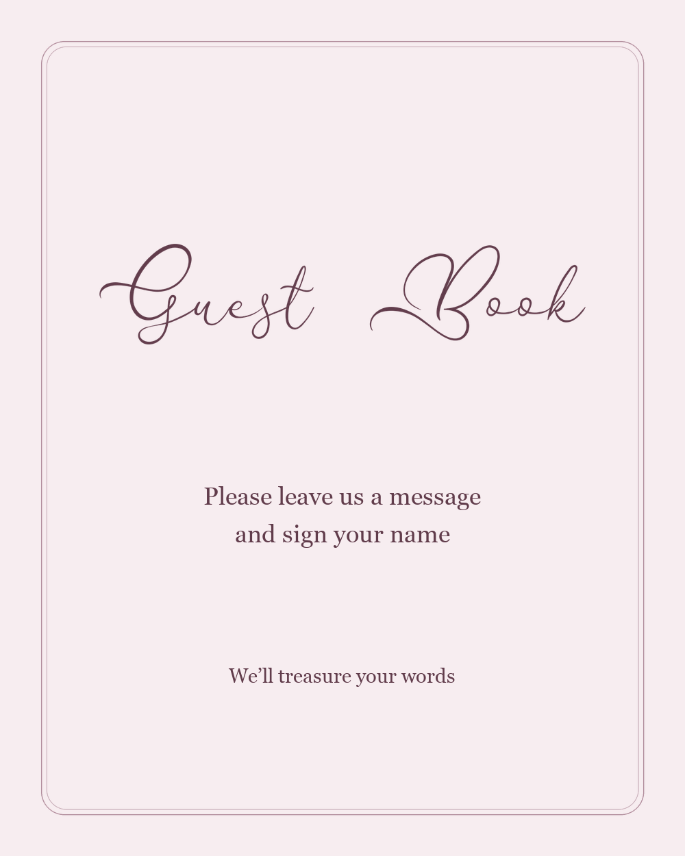
Romantic guest-book sign: Flanella with Georgia
The LittleSizzle photo-guestbook sign on Pinterest separates a decorative script heading from short, plainly set instructions. Our example uses that hierarchy for a conventional written guest book: Flanella introduces the station, and Georgia tells guests to leave a message and sign their name.
A soft blush background and fine double frame suit the delicate loops, but the lettering remains dark enough to stand apart. The heading, instruction, and closing line form three separate blocks with visible space between them. Keep the instruction easy to read; if you use a photo guest book instead, replace it with the actual steps guests need to follow.
Simple reserved card: Mandala Wedding 2 with Arial
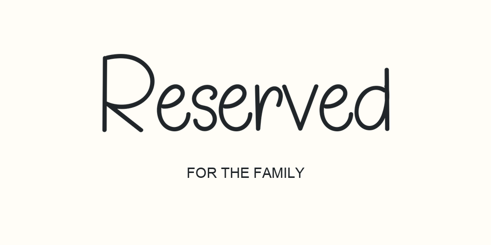
The CardsbyFidem reserved table-tent sign on Pinterest uses a low, wide shape with a large Reserved label and a smaller line identifying the group. Our version follows that practical hierarchy with upright Mandala Wedding 2 lettering and a plain Arial supporting line.
Reserved takes most of the usable width, while “FOR THE FAMILY” supplies the detail without lengthening the decorative heading. Replace that line with the specific group when needed. The lower margin leaves breathing room around the message, but check your actual holder or fold before printing. This illustration shows the front face only; it is not a folding template.
Reproduce the comparisons with your own text
Enter the exact label in the Wedding Text Generator and start with the Wedding style group. The tool accepts up to three lines and up to 35 characters per line. Keep punctuation and capitalization as you intend to use them, then generate the previews and open the fonts you want to compare.
For the first pass, keep size, color, stroke, and background settings unchanged. Save a shortlist with the font names. Place them in copies of the same card layout, using the same maximum width and height for the lettering. Do not stretch an image horizontally to make a narrow design look wider. The way it naturally fits is part of what you are evaluating.
Next, change one useful variable. Compare one line with two in the same font, or compare a short and long wording choice in the same card. If you change the wording, font, background, and dimensions together, it becomes harder to tell which change helped.
Switch Back off when exporting lettering for an existing card background. Use PNG when the destination accepts raster images, or SVG when your layout workflow supports vector artwork. Keep the original file and record the text, font, size, alignment, line height, color, and stroke settings so you can regenerate a matching sign later.
The generator creates the lettering artwork. Add the card background, supporting text, and any print layout in a separate design application. For coordinating these choices with the invitation, see How to Choose Calligraphy Fonts for Wedding Invitations.
Choose a consistent set without forcing every sign to match
A coherent wedding collection can share a color, a supporting font, and a general treatment while giving different pieces the space they need. A gift-table sign may suit two lines, while a table number needs one clear numeral or name. Preserve the visual relationship, then adjust the arrangement for the task.
| What you see in the layout | Change to compare first |
|---|---|
| Large initials but tiny lowercase letters | A less capital-dominated font or a taller lettering area |
| A long phrase squeezed across a portrait card | An intentional two-line arrangement |
| Thick strokes crowding one another | A less dense font or more space |
| A decorative phrase with an unclear purpose | A direct label or a plain supporting instruction |
| One table name that does not fit the set | Test the longest labels before fixing the shared layout |
Conclusion
Choose wedding sign lettering by comparing the real message inside the real shape of the card. In these examples, font choice changes the balance between capitals and lowercase letters, a line break makes better use of a portrait layout, and shorter wording changes how large the artwork can appear. Use those comparisons to narrow the options, then check the selected design at its intended printed size before producing the full set.
Frequently asked questions
Which of these fonts should I try first?
Dancing Script is a useful starting point for the “Cards & Gifts” example because the whole phrase has a flowing, substantial appearance. Compare Amellinda Weddings for a heavier treatment, Elegant Wedding for prominent capitals, Flanella for fine loops, and Mandala Wedding 2 for upright, separate letters. Preview your own wording before deciding.
Should a wedding table sign use one line or two?
Use the card shape to guide the comparison. A short single line can suit a wide card. In the portrait example here, two lines use the available height and allow larger individual letters after placement. Check the finished image rather than choosing by line count alone.
Does size 72 mean the printed lettering is 72 points?
Do not treat the generator setting as the final physical print size. The exported artwork changes size when you place it in a layout. Set the card dimensions and image placement in that layout, then check a print at the intended size.
Can I use a transparent background?
Yes. Switch Back off before generating the lettering. The lettering files are transparent; the card backgrounds and frames are added separately. Keep a background in the lettering export only when it belongs to the artwork you intend to place.
Can I use the same font for all the table numbers?
You can start that way, but test the full set of labels. Short words, long words, and numerals can occupy very different amounts of space. Include the longest table name or number wording in your first comparison.
Can I edit the words after downloading the image?
Return to the generator to change the wording and generate a new result. Keep supporting instructions as ordinary text in your layout application so they remain easy to revise without recreating the decorative heading.