Turn Your Text into Printable Calligraphy
Take a name or short phrase from the generator to a printed card, a PDF, or a lettering project. Compare real samples before choosing a font.
A name can look beautiful in a font preview and become difficult to read when it is squeezed onto a place card. A phrase that works on white paper can disappear against a colored background. The useful part of a calligraphy generator is being able to test your own words before committing them to a document or a physical project.
A name card, an award certificate, a tattoo, and a T-shirt ask different things of the same letters. This guide compares those settings through generated lettering, finished layouts for print and PDF, and photographs. It also includes a creative activity for a class or workshop. The samples show fonts available in our calligraphy and cursive generator, with settings you can reproduce using your own words.
Start with the words and the space they must fit
Enter the actual name or phrase first. Different capitals, repeated letters, and descending strokes change the shape of a line. “Emma Wilson” and “Alexandra Montgomery” will not occupy the same space, even with identical settings.
Decide where the lettering will go before choosing a font. A place card has a small, fixed area. A certificate usually gives the recipient’s name more room. A tracing template needs enough space to follow the strokes with the tool you intend to use.
The examples below cover different constraints: fitting a long name, preserving fine strokes on small paper, reading a heading from farther away, and placing lettering inside a document. Choose the closest task, then test your own wording in its intended space.
| Project | Text to generate | Check before exporting |
|---|---|---|
| Place card for a dinner or workshop | Alexandra Montgomery | Does the longest name remain readable without squeezing the letters? Compare one line with two. |
| Wedding invitation | Olivia & James | Do the capitals and ampersand fit together without touching the date or venue details? |
| Welcome sign | Welcome to our celebration | Can the phrase be read from the distance where guests will first see the sign? |
| Gift tag or product packaging | Made with love | Do the small loops remain open at the tag’s actual size, and is the lettering clear against the packaging? |
| Thank-you card | Thank you, Ms Carter | Does the teacher’s name still fit comfortably when added to the short greeting? |
| Transfer template for a handmade sign | Make yourself at home | Is there enough room to follow the thin strokes with the marker you will actually use? |
| Reading award or course certificate in PDF | Emma Wilson | Does the recipient’s name fit between the award title and achievement text, including its upper and lower strokes? |
| Cover for a class poetry collection | Our words, our world | Does the decorative title leave room for the class name and year? |
| Chapter heading in a PDF workbook | A new beginning | Does the heading remain legible at normal page view, with enough space before the first exercise? |
| Classroom display heading | Our reading corner | Are the words recognizable from across the room? Keep detailed instructions in ordinary text. |
| Creative lettering activity | Create something new | Are the letter shapes clear enough to compare, with room on the page for learners’ own interpretations? |
| Personalized bookmark | One more chapter | Will a stacked arrangement fit the narrow shape better than a tiny single line? |
| Comic or manga project cover | Moonlight Academy | Does the style fit the story’s mood while keeping the title distinct from the illustration? |
| Tattoo lettering concept to discuss with an artist | Still growing | Does the wording and overall shape communicate the idea at the proposed size? Let the artist assess the final lettering for the placement. |
Keep dates, instructions, and longer explanations as ordinary text in your layout. Generate the short decorative element separately so you can move and size it without rebuilding the entire page.
Compare the same name in three styles
These samples use size 72, line height 1, left alignment, dark text, Stroke set to None, and Fill set to None. Their transparent backgrounds let you place them on an existing card or document background. The illustrations below are lettering samples, not life-size print proofs.



For a name card, put each candidate in the same available area and preserve its proportions. Compare the whole name, including the surname. If a style only works when it is very large, it may be a better fit for a certificate than a small card.
For a set of cards, test your longest name early. Give all cards the same placement area, but do not stretch a short name sideways to match a longer one. If you need to reduce a long name substantially, consider a simpler style or a two-line arrangement for the set.
Compare the lettering inside a finished name card
The three folded table cards below use the same wording, card proportions, and 235-pixel lettering width. From top to bottom, the fonts are Caveat, Parisienne, and Great Vibes. The supporting text stays the same. These are illustrative layouts made from the generated samples, so the comparison isolates what the font contributes rather than changing the whole design each time.
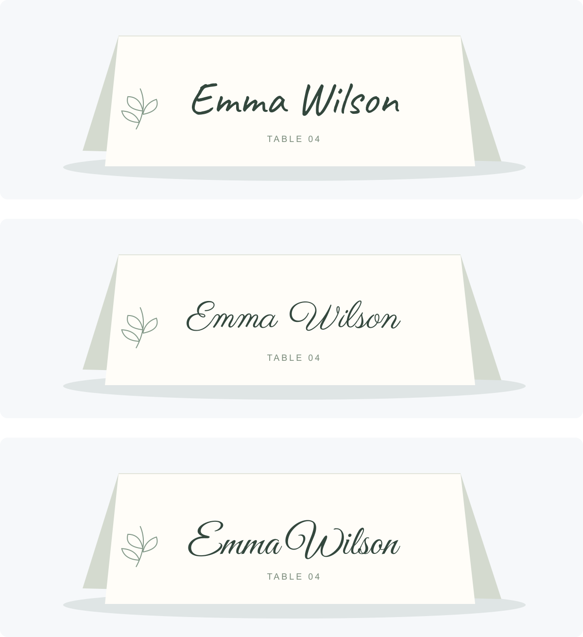
Caveat makes the card feel informal and personal. Parisienne gives the same name a more continuous, flowing appearance. Great Vibes puts more emphasis on the decorative capitals; inspect the transition between the first name and surname before choosing it for a small card. These observations apply to this name: another set of letters can change the result.
| Decision | What the comparison shows | What to try next |
|---|---|---|
| Informal workshop or class event | Caveat has an everyday handwritten character | Test the longest participant name in the same card area |
| More formal name card | Parisienne gives the name a flowing shape | Check the fine strokes in a print proof |
| Decorative focal point | Great Vibes gives the capitals more presence | Give the name room and keep supporting text simple |
| A much longer name | Matching font settings will not guarantee a matching width | Try two lines before making every letter very small |
For a longer example such as “Alexandra Montgomery,” keep the card dimensions fixed and compare a single line with a first-name/surname split. The meaningful comparison is whether someone can read the card comfortably, not whether every card uses the same size number in the generator.
For a wedding, the wedding text generator offers a more focused starting selection. Our wedding invitation font guide explores choosing lettering for invitations, while this article follows the lettering through placement and printing.
Put the name into a certificate or other PDF layout
A school reading award, course certificate, or workshop certificate gives the lettering a specific job: identify the recipient. Start with the document in your page-layout application. Add the generated name as an image, then leave the award title, date, and explanatory text editable around it.
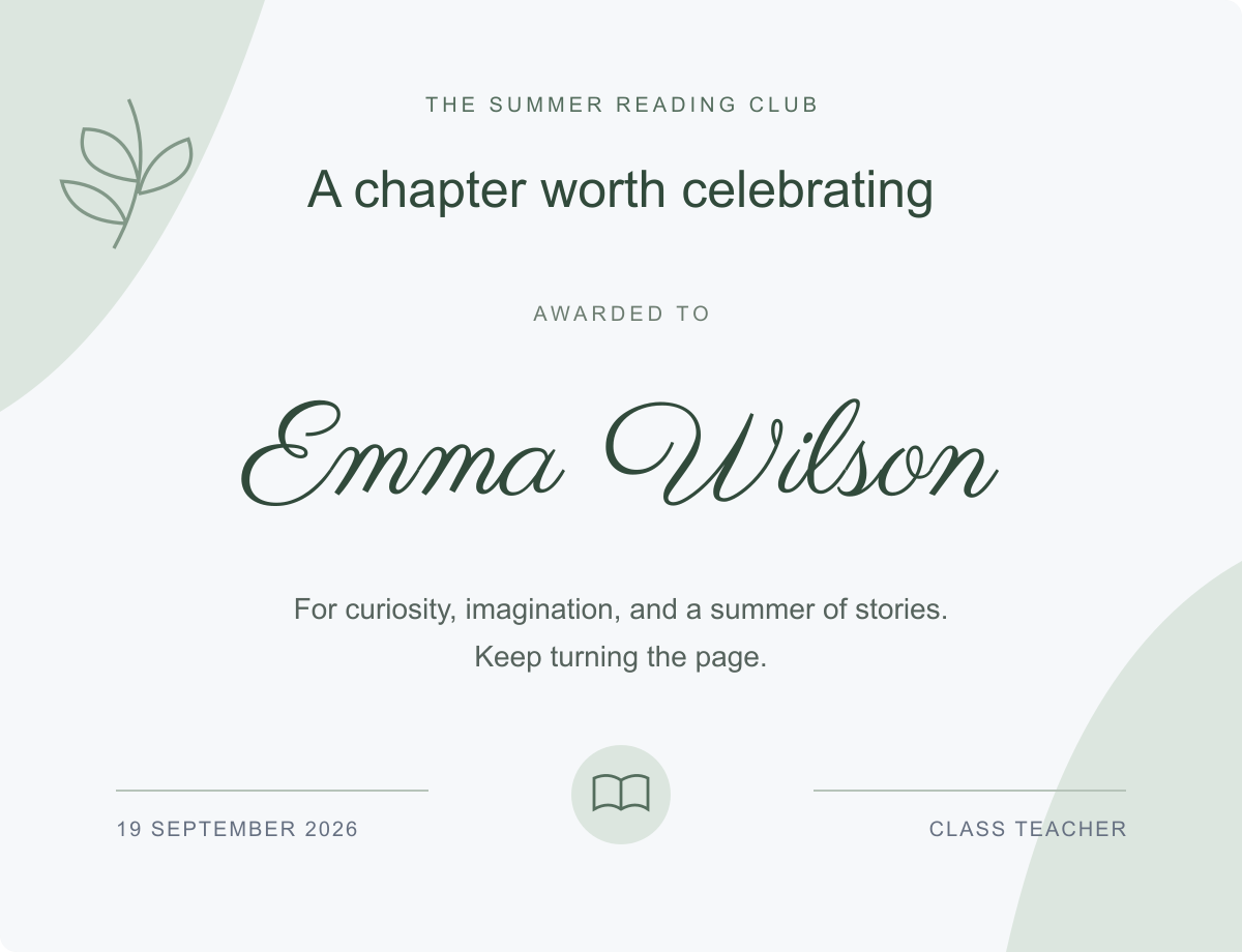
In this example, the generated name sits between “Awarded to” and a sentence describing the achievement. That arrangement gives the lettering a clear purpose. The certificate title identifies the award, the script identifies the recipient, and the remaining text supplies the details.
To adapt it for a real class, build one document template and replace the name image for each student. Test the longest name first. Keep the certificate title and body text at consistent sizes; adjust the name placement without squeezing the whole page. Save the editable document as well as the PDF so corrections do not require reconstructing the design.
| Part of the certificate | Treatment in this example | Reason |
|---|---|---|
| Award title | Plain text | Makes the document’s purpose immediately clear |
| Recipient name | Generated Parisienne image | Creates the personal focal point |
| Achievement | Ordinary editable text | Keeps a complete sentence readable and easy to update |
| Date and issuer | Smaller ordinary text | Supplies the details without competing with the name |
Choose Fill → None in the generator if the document already has a background. Otherwise, the lettering image may arrive with a rectangular background that covers the design beneath it. Test the name against the actual page color; transparency alone does not guarantee enough contrast.
Use PNG when your layout application accepts images but does not support SVG import. Use SVG when the application supports it and you need to resize the lettering substantially. The generator exports PNG and SVG; create the final PDF from the application where you assemble the page.
Before sending the PDF, open the exported file and inspect the name again. Check the edges of capitals, descenders, and any strokes near a border. Print one page at the intended size: a large screen preview can hide lettering that is too small on paper. Keep a plain-text version of the recipient’s name elsewhere in the document when it needs to be searchable or accessible; an image should not be the only place that information exists.
Put lettering on covers, packaging, and gifts
The following illustrations place newly generated phrases in simple design mockups. They are original layout studies, not photographs of manufactured products. Each one uses a short piece of lettering to solve a different placement problem.
Book covers and personal journals
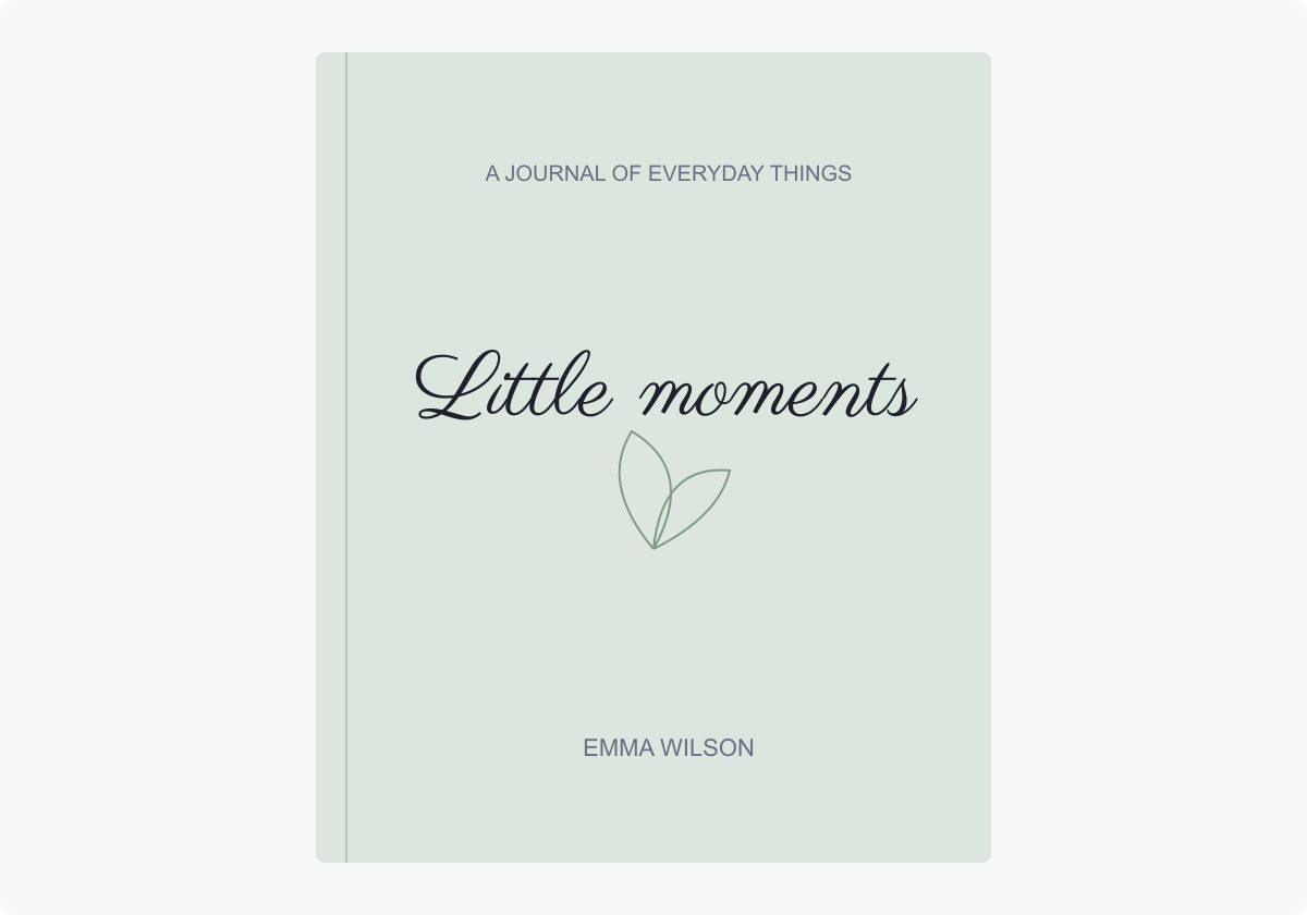
“Little moments” is the title here, so it gets the most expressive type. The small description and author name stay plain. The empty space above and below the title helps it feel like a cover rather than a label crowded with information.
Try this for a family recipe book, a travel diary, or a student’s poetry collection. Generate the actual title before choosing the cover arrangement: “Little moments” fits a single line, but a longer title may need a deliberate break. For a PDF edition, also check the cover as a small thumbnail; the title needs to survive that reduction.
Coffee bags, menus, and product labels
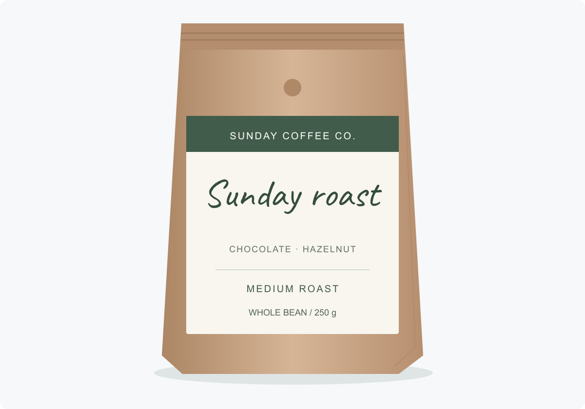
The handwritten “Sunday roast” gives this coffee bag a relaxed character. “Whole bean” and the weight remain separate, practical information. A similar arrangement works on a bakery bag, a candle label, or a menu heading: let the script identify the product or section, then make the details easy to scan.
Before ordering labels, print the design at its actual dimensions and place it on the package. A flat label preview will not show how much disappears around a jar or bottle. Keep essential wording within the part a customer can see from the front.
Mugs, glasses, and bottles
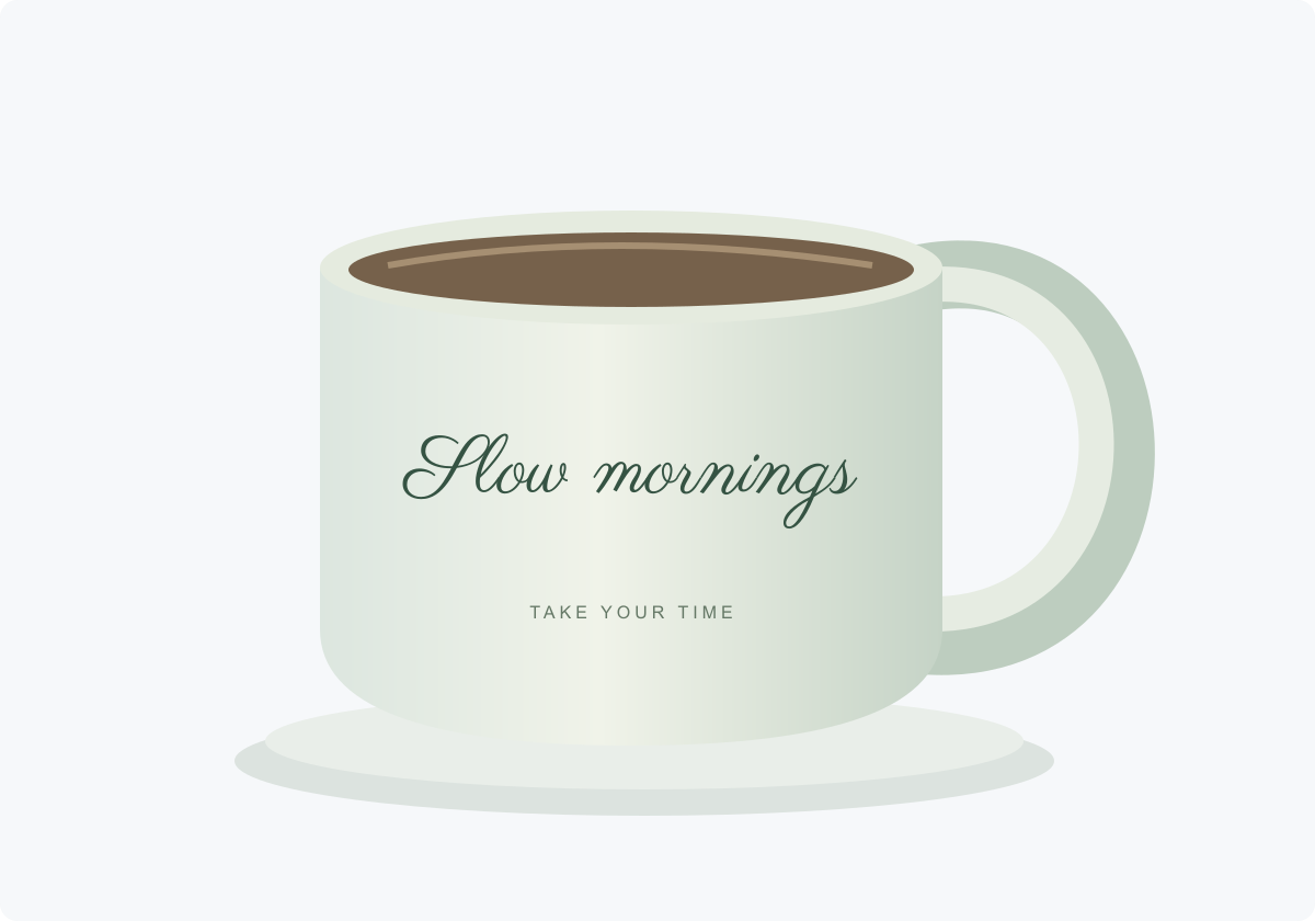
“Slow mornings” suits an object someone picks up every day. A name, a short dedication, or a two-word greeting can work in the same position. The phrase should feel centered on the visible face of the mug, rather than merely centered inside a large rectangular print file.
Use the supplier’s placement template when preparing artwork. Check which side faces outward when the handle is held, and whether the words approach the curved edges. For a glass or bottle, preview the lettering against what will sit behind it: a transparent surface does not provide a consistent background color.
Initials for embroidered gifts
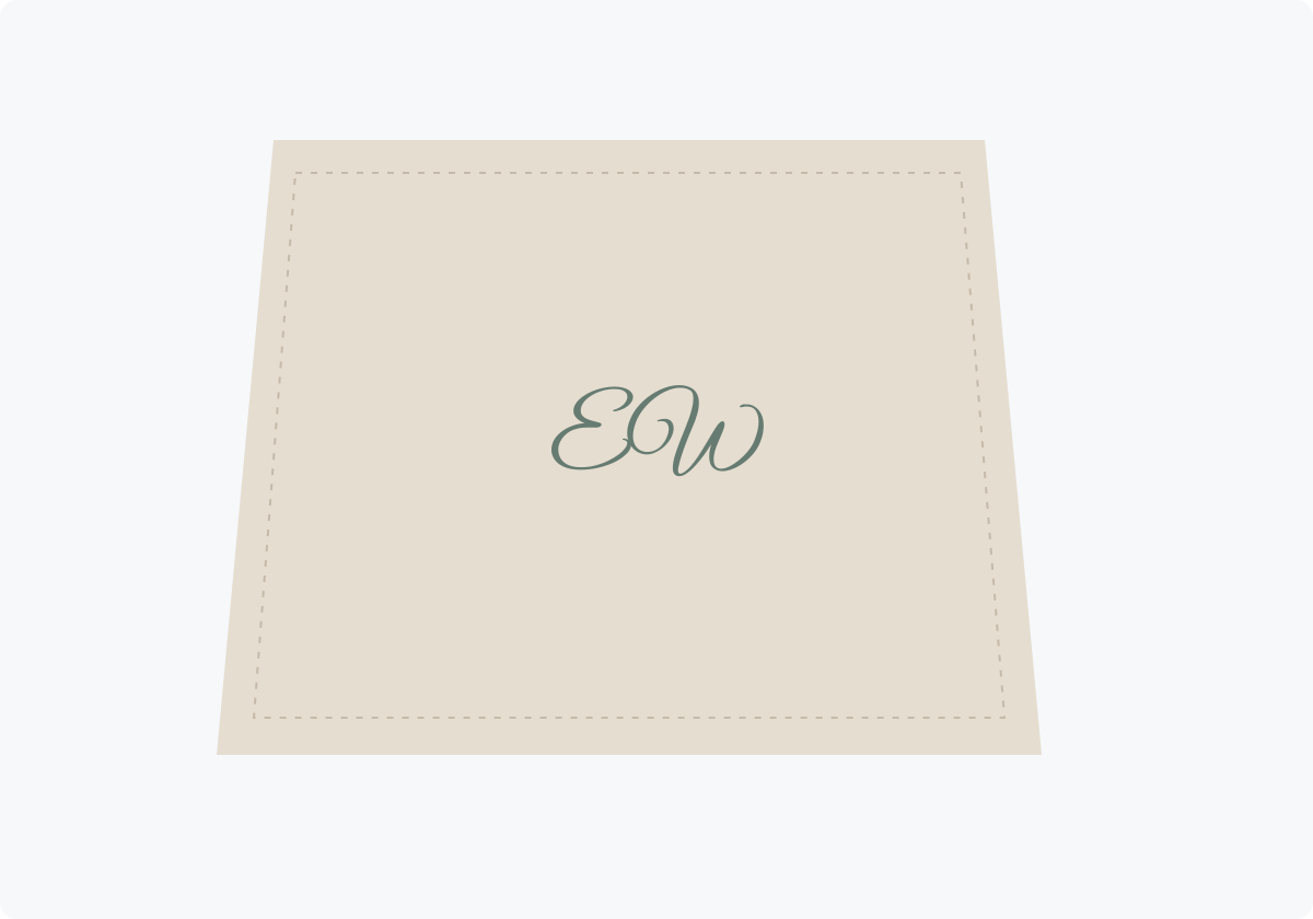
A monogram can personalize a towel, robe, napkin, or fabric bag without covering it in text. In this example, “EW” is intentionally small relative to the fabric. Compare the initials together: decorative capitals that look attractive separately can collide when placed side by side.
This is a placement sketch, not an embroidery-ready file or a simulation of stitches. Send the concept to the embroiderer so they can adapt the strokes and spacing for their process. Do not assume that an SVG export is a machine embroidery file. Ask for a sample before committing to a set of gifts.
Shop windows and mirrors
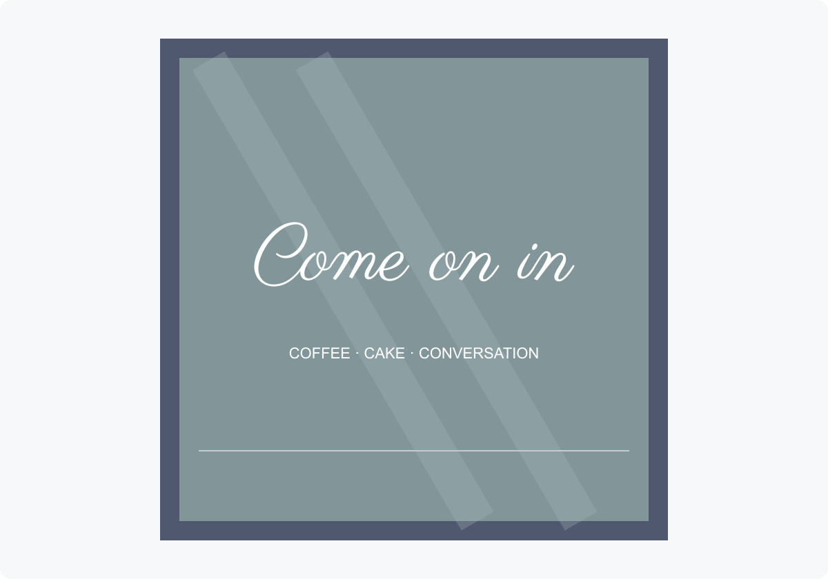
“Come on in” is readable as a single greeting, with the smaller line explaining what is inside. On a real window, the background changes with the light, reflections, and interior behind the glass. Check the design from the pavement, not only from inside the shop.
For a mirror at an event, the same idea can introduce a welcome message or a seating area. Keep flourishes away from any names or instructions that visitors need to find quickly. If the design will be applied to the inside of glass, confirm the reading direction with whoever prepares the transfer.
For a hand-lettered sign, print the lettering at its final size and test your transfer method on scrap material. The outline must leave enough room for the marker you plan to use. Our wedding table sign guide covers choosing lettering for signs that guests need to read from a distance.
Quote posters

“Make room for wonder” does most of the work in this poster. The circle supplies a small amount of color, while the remaining space lets the lettering stand out. A longer quotation would need a different composition, with planned line breaks and room for an attribution.
Try two versions before printing: one with only the lettering, and another with a simple background shape. Keep the version in which the words are easiest to read. For a classroom poster, check it at the distance from the desks; a close-up preview is not the viewing condition that matters.
Album and single covers
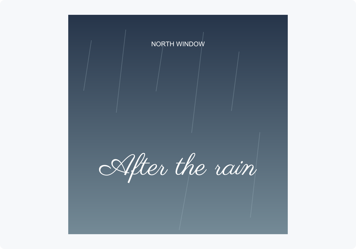
“After the rain” gives this fictional release a reflective mood. The artist name stays in plain uppercase text, making the two pieces of information distinct. The lettering has a quiet part of the image to sit on instead of crossing every background detail.
Test a music cover at thumbnail size as well as full size. Thin script can look elegant on a large square and disappear in a small list of releases. If that happens, enlarge the title, simplify the background behind it, or compare a heavier font. For a more energetic illustrated project, try the manga and anime font generator; for a restrained title, start with the calligraphy generator.
Lettering on a T-shirt: one word can carry the design
A short script word can give a shirt its whole character. These product photographs compare white lettering on black fabric with red lettering on white. Both leave enough empty fabric around the word to keep it easy to read.
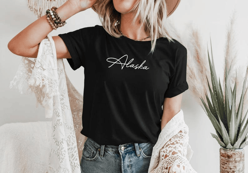
“Alaska” sits in a small area across the chest. The contrast lets the fine script remain visible without making it oversized. The space around the word is part of the design: enlarging it to fill the shirt would create a very different effect.
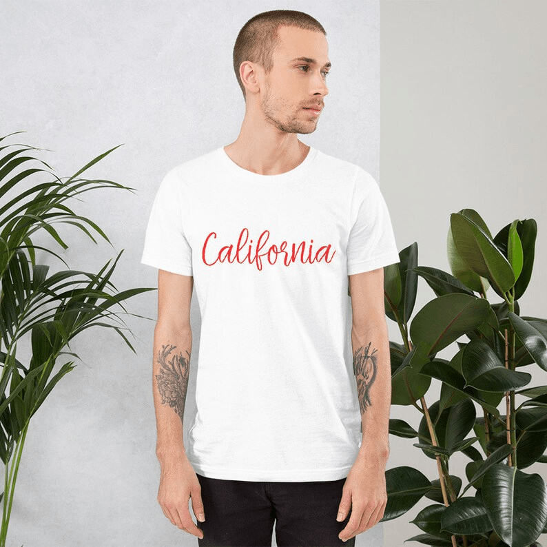
“California” uses color to draw attention to a simple centered line. The slant gives the word movement, while the plain fabric keeps it readable. Compare the two shirts when planning your own design: the garment color and the lettering color work together.
For your own shirt, start with an original short phrase such as “Weekend wandering.” Compare a flowing cursive version with a heavier option from the brush font generator. Place the export at its intended physical width in a mockup, then ask the printer to check the thin strokes for the chosen process. Do not assume that a line which looks clean on a screen will print equally well with every fabric and printing method.
Lettering on skin: placement changes the composition
A tattoo reference is useful because the writing no longer sits on a flat white rectangle. The forearm gives a long composition a natural direction, while its curve changes how much lettering you can see at once. These photographs show existing work by tattoo artists, not tattoos created with our generator.
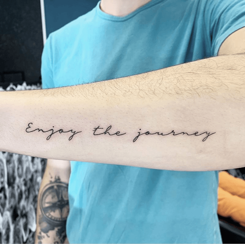
“Enjoy the journey” uses a single line with clear spaces between the words. The lettering feels handwritten without surrounding the phrase with decoration. This is a useful reference for testing your own words: check whether the full sentence reads easily at the proposed length.
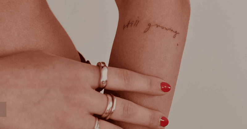
“Still growing” keeps the lettering small and simple. The space between the words makes the short phrase easy to separate, and there are no large flourishes competing with it. Compare the actual words in your own preview rather than choosing a style from an ornamental alphabet alone. Use the tattoo font generator to bring a few wording and style options to an artist. Include the intended placement and approximate dimensions. The artist should decide how to adapt the letterforms and spacing for the finished tattoo; a font preview is a starting reference.
Use generated lettering in a creative learning activity
A practical classroom or workshop activity is to compare how the same short phrase changes across styles. Learners can look at the shape of capitals, the spacing between words, and the difference between separate and joined-looking letters, then sketch their own interpretation.
Example: a short lettering workshop
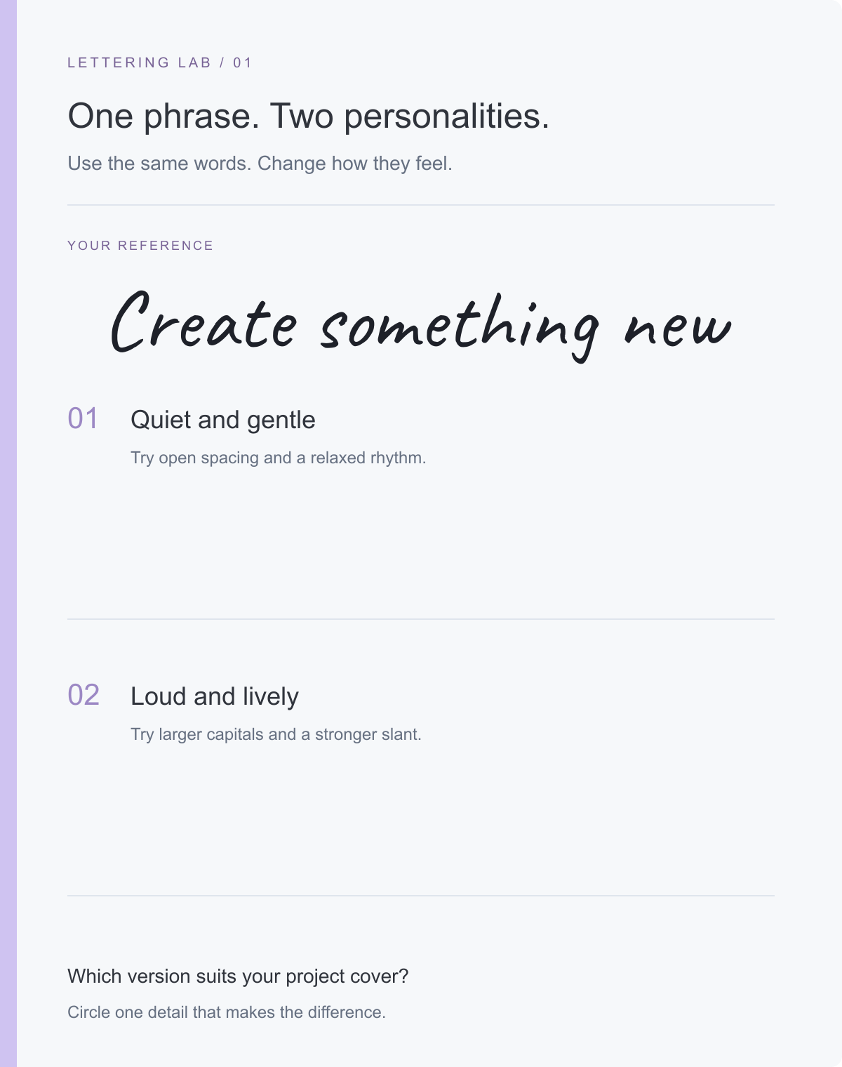
Give learners the reference phrase and ask them to make two versions: one calm and simple, another bold and energetic. Before drawing, have them point out one detail they want to change, such as the shape of the capital C, the distance between words, or the slant of the letters. Afterward, ask which version suits a project cover and why.
The output could become a bookmark, a sketchbook title, or a cover for a class anthology. For a comic or manga project, the manga and anime font generator provides another set of styles to compare. Keep the exercise grounded in a specific design question: does the lettering match the mood of this particular cover?
This activity is about observing and designing lettering. The blank writing areas leave room to experiment without implying that the sample is a prescribed handwriting model.
School handwriting practice has more specific requirements. Teachers use custom worksheet tools to prepare names, spelling words, and topic-related sentences; Teach Starter describes these uses. A tool such as the Getty-Dubay worksheet creator also supplies a defined handwriting model, line heights, and dashed letterforms.
Our decorative font images do not provide stroke-order instructions or school-specific tracing guides. For teaching letter formation, use the model selected by the teacher. For learning calligraphy technique, an instructional resource such as The Postman’s Knock worksheets explains how to form letters and connect them into words. A finished font sample alone cannot explain those movements.
Choose the file for the next step
Choose the export according to where the lettering will go. PNG and SVG are lettering assets; PDF is the document you may assemble around them. A higher-resolution PNG does not change the physical dimensions you choose in your layout application.
| Format | Useful for | Check before committing |
|---|---|---|
| Transparent PNG | Placing lettering in an application that accepts ordinary images | Enough pixels for the intended output size; no unwanted background |
| SVG | Resizing lettering in an application with SVG support | Import a sample and confirm that all strokes appear correctly |
| PDF from your layout application | Sharing or printing the completed card, certificate, or activity sheet | Page dimensions, image placement, and a final exported-file check |
If you need characters to paste into a message or profile instead of an image for a layout, the workflow changes. Our guide to fancy text versus font images explains that distinction before you choose a generator.
Fix the problem you can actually see
Use a proof of the intended output to decide what to change. One small adjustment is easier to evaluate than changing the font, size, color, and outline together.
| Problem in the proof | First change to try | What to inspect afterward |
|---|---|---|
| Fine strokes disappear | Increase the placed size or compare a sturdier font | Small loops and thin connecting lines |
| Long name looks cramped | Compare a two-line arrangement | Balance between the first name and surname |
| Lettering looks soft after enlargement | Use a supported SVG or export a larger PNG from the source | Edges at the intended output size |
| White rectangle covers the page design | Regenerate with Fill set to None | Transparency against the actual page background |
| Stroke makes letters look clogged | Reduce or remove Stroke | Open spaces inside letters such as e and a |
| Decorative text overwhelms a certificate | Restrict the script to the recipient’s name | Clear hierarchy between title, name, and details |
| Flourishes touch a frame or neighboring text | Increase the placement area or simplify the font | The entire outline, including upper and lower strokes |
Check the finished size before making more copies
The generator’s size setting is a starting point for the exported artwork. Its physical size on paper depends on how you place and scale that artwork in the final document.
Check one card or page before producing a set. Look for broken-looking fine lines, cramped spaces inside letters, clipped strokes, and a background rectangle you did not intend to include. Read the lettering without zooming in. If it fails that check, return to the font choice or layout before making the print larger or adding an outline.
Start with your own name or phrase in the calligraphy text generator, compare a few styles, and keep the result that works in the space where it will actually be used.
Common questions
Can I download the lettering as a PDF?
The generator exports PNG and SVG. Place the lettering in your document or layout application, then export that document as a PDF.
Can I make a transparent calligraphy image?
Yes. Set Fill to None before generating, then download the lettering as PNG or SVG. Check its contrast against the background where you plan to place it.
Can I use these fonts for school handwriting worksheets?
These are decorative lettering samples. They do not provide a school handwriting model, tracing guides, or stroke-order instructions. Use the teacher’s chosen handwriting resources for letter-formation practice.