How to Choose Calligraphy Fonts for Wedding Invitations
Compare five calligraphy fonts using the same names, explore invitation layouts, and choose readable lettering for your wedding stationery.
Choose a calligraphy font by testing the couple’s actual names at the size they will appear on the invitation. Look for recognizable letters, enough room for decorative strokes, and a style that suits the event. Then pair that expressive lettering with simpler text for the date, venue, and RSVP details.
The most useful comparison is not a page of unrelated font samples. It is the same names in a small set of different styles, placed into the same amount of space. This guide shows five real lettering samples and five invitation layouts and a practical way to narrow the choice before you build the finished invitation.
Give calligraphy a clear role
An invitation has several jobs: it introduces the couple, communicates the occasion, and tells guests where and when to attend. Those jobs do not need the same typography. Calligraphy can make the names memorable while a quieter font handles information that guests need to read quickly.
Start with one script face for the main lettering and one simpler face for supporting details. This is an editorial starting point, not a rule that every invitation must follow. It helps you avoid comparing two ornate scripts that both want attention. Monotype’s guide to font pairing similarly treats hierarchy and readability as purposes of combining typefaces.
| Invitation element | Useful starting treatment | What to check |
|---|---|---|
| Couple’s names | Calligraphy as the main feature | Both names are immediately recognizable |
| Short introductory phrase | Small supporting text or restrained script | It does not compete with the names |
| Date and time | Simple, readable type | Numerals and punctuation are clear |
| Venue and address | Simple supporting type | Long words fit without squeezing |
| RSVP information | Ordinary text with clear spacing | Guests can find the action and details |
Compare the same names in different styles
These five samples use “Olivia & James” from the Free Wedding Text Generator. To reproduce them, choose Wedding, Size 72, left alignment, Line height 1, text color #1E2129, Stroke 0, and Back off. The transparent exports are shown at the same lettering width, with their proportions preserved. This tests how each font occupies a fixed space; it does not imply that their lowercase letters are the same height.
The descriptions below refer to the letters visible in these generated samples. Try your exact names before choosing: a different capital, a longer surname, or an accented letter can change the balance.
1. Dancing Script: flowing and lightly informal
The rightward lean, open loops, and changing stroke weight give Dancing Script a quick, fluid rhythm. The capital O and J remain close enough in scale to the lowercase letters that the words read as continuous names. Its curved ampersand fits that rhythm instead of becoming a separate ornament. Try it when you want a personal-looking headline with relatively little decoration. Check the joins around “ivia” when reducing the artwork.

2. Elegant Wedding: tall initials and formal contrast
Elegant Wedding makes the O and J much taller than the following letters. Fine loops contrast with darker downstrokes, while the small lowercase forms create a more formal, delicate silhouette. It suits a names-first composition with generous vertical space. The tradeoff appears at small sizes: the initials can still look impressive after the lowercase letters have become too small. Judge the whole name, especially “ames,” before committing.

3. Flanella: fine, airy handwriting
Flanella adds a distinctly lighter option to the shortlist. Its thin, relatively even strokes, broad loops, and loosely connected letters leave more open space inside the line. The loop of the O extends across its base, and the J reaches below the smaller letters. This is a useful direction for understated, romantic stationery. Keep the ink dark enough and the names large enough; pale color and a small placement can make this already fine line disappear.

4. Angglea Wedding: rounded and playful
Angglea Wedding is more upright and rounded, with a wide, looping ampersand and heart-shaped dots over the i letters in Olivia. Those hearts are part of this font’s generated lettering, not decorations added to the image. This makes the sample feel cheerful and explicitly romantic. Use it when that detail fits the invitation; if you want a restrained mood, changing the color will not remove the hearts. Also check the wide ampersand when space is tight.

5. Amellinda Weddings: bold brush-like lettering
Amellinda Weddings has the darkest silhouette in this comparison. Thick rounded downstrokes, compact joins, and a substantial ampersand give it a brush-lettered character. It can hold attention beside a small illustration or stronger color scheme. The extra weight is not a reason to shrink it aggressively: enclosed spaces and close joins still need room to stay open. Pair it with quieter details instead of making the whole invitation equally bold.

Test the name before judging the mood
Read the preview without relying on your knowledge of the words. Are there letters that could be mistaken for one another? Do adjacent loops merge? Is the space between the two names obvious? A typeface can feel romantic while still being the wrong choice for a particular combination of letters.
Check the ampersand as well. In some scripts it becomes a large decorative feature; in others it behaves like a small connector. If it overwhelms the names, try writing “and” instead and generate a new comparison. Choose the version that makes the names feel balanced without changing their spelling merely to accommodate a font.
Accented letters and names from different writing systems need a direct preview. A font’s style category does not guarantee that it supports every character. If a required character is missing or looks out of place, choose another candidate rather than silently removing the accent.
Pair the lettering with the details
A font pairing works through scale, spacing, and placement as well as the two typefaces. The five original examples below turn design ideas observed in Pinterest invitations into layouts using our generated names. They are not copies of those invitations, and the font pairings are our own. The paper colors and supporting text were added separately; the lettering exports themselves remain transparent. All names, dates, and venue details in the mockups are illustrative.
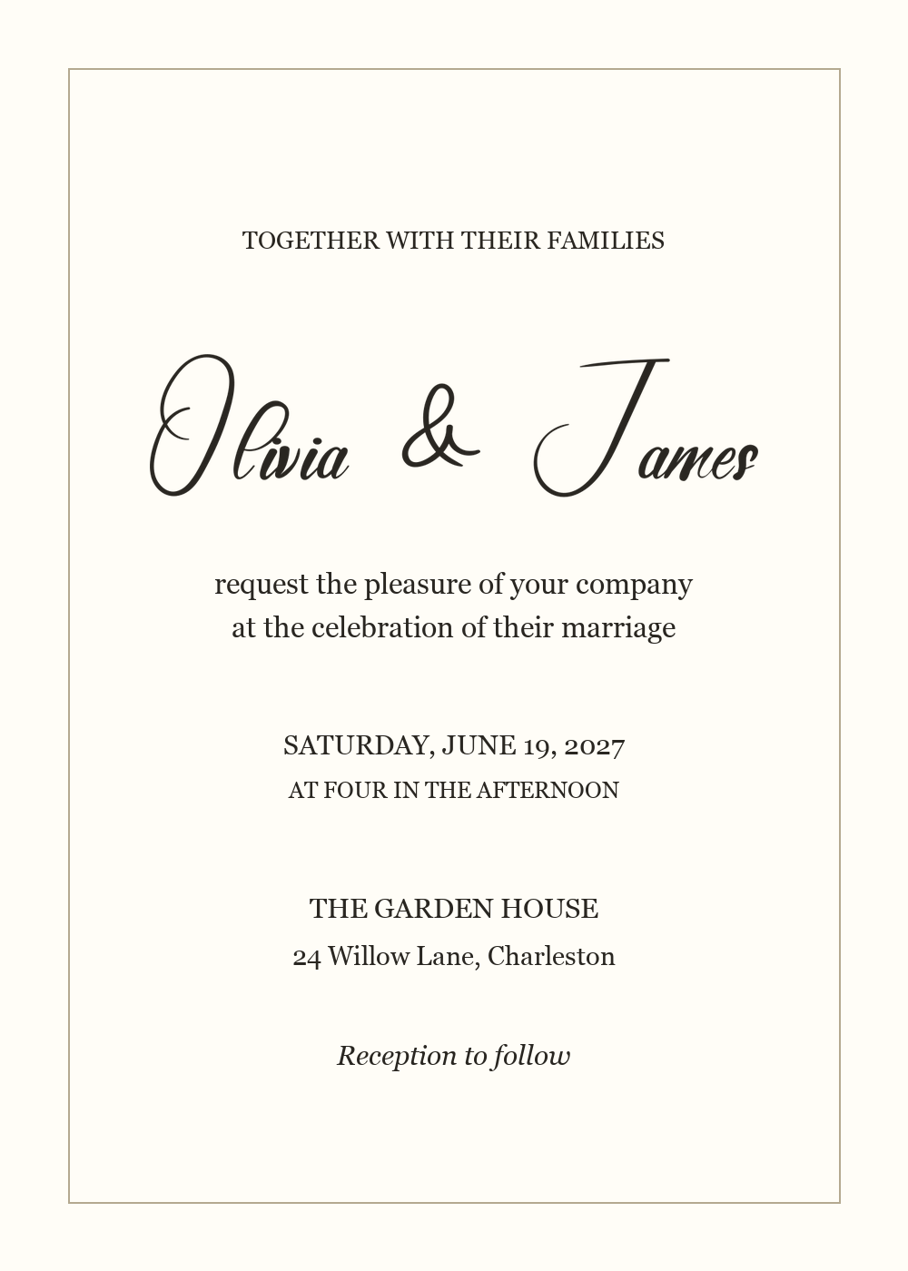
1. Classic formal: Elegant Wedding + Georgia
The Brittany invitation on Pinterest separates expressive script from a compact serif information block. Borrow that clear division of roles. In our version, Elegant Wedding carries the names, while Georgia handles the invitation wording, date, and venue. Center the blocks on one axis, leave extra space around the tall initials, and use a thin border rather than another flourish.
For a 5 × 7 inch layout, start with the names about 3.4 inches wide and Georgia details around 10–12 pt. These are trial settings, not print guarantees. If the lowercase names look too small, enlarge the lettering or switch to Dancing Script before squeezing the details.
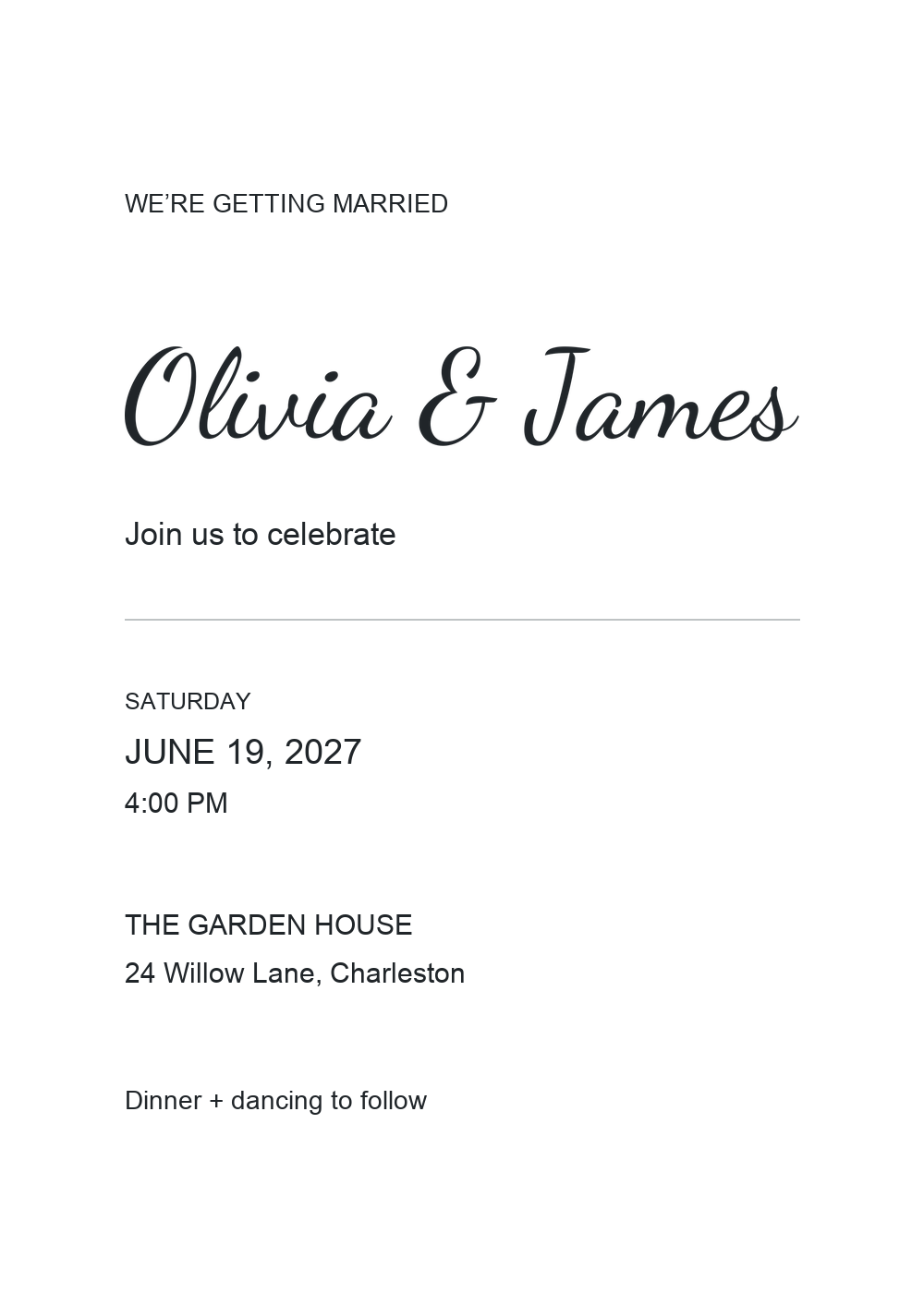
2. Modern minimal: Dancing Script + Arial
The minimalist Jenna and Matthew invitation on Pinterest leaves a large area empty and gathers the details into a compact block. Its lesson is deliberate placement, not simply removing decoration. Our version pairs Dancing Script with Arial and aligns the supporting copy to one left margin. A single rule separates the expressive names from the practical information.
Keep Arial regular for the longer lines and reserve capitals for short labels. Leave the empty upper space empty; adding a second script or an ornamental divider would change the premise. Check that the venue and date remain easy to locate without making every line the same size.
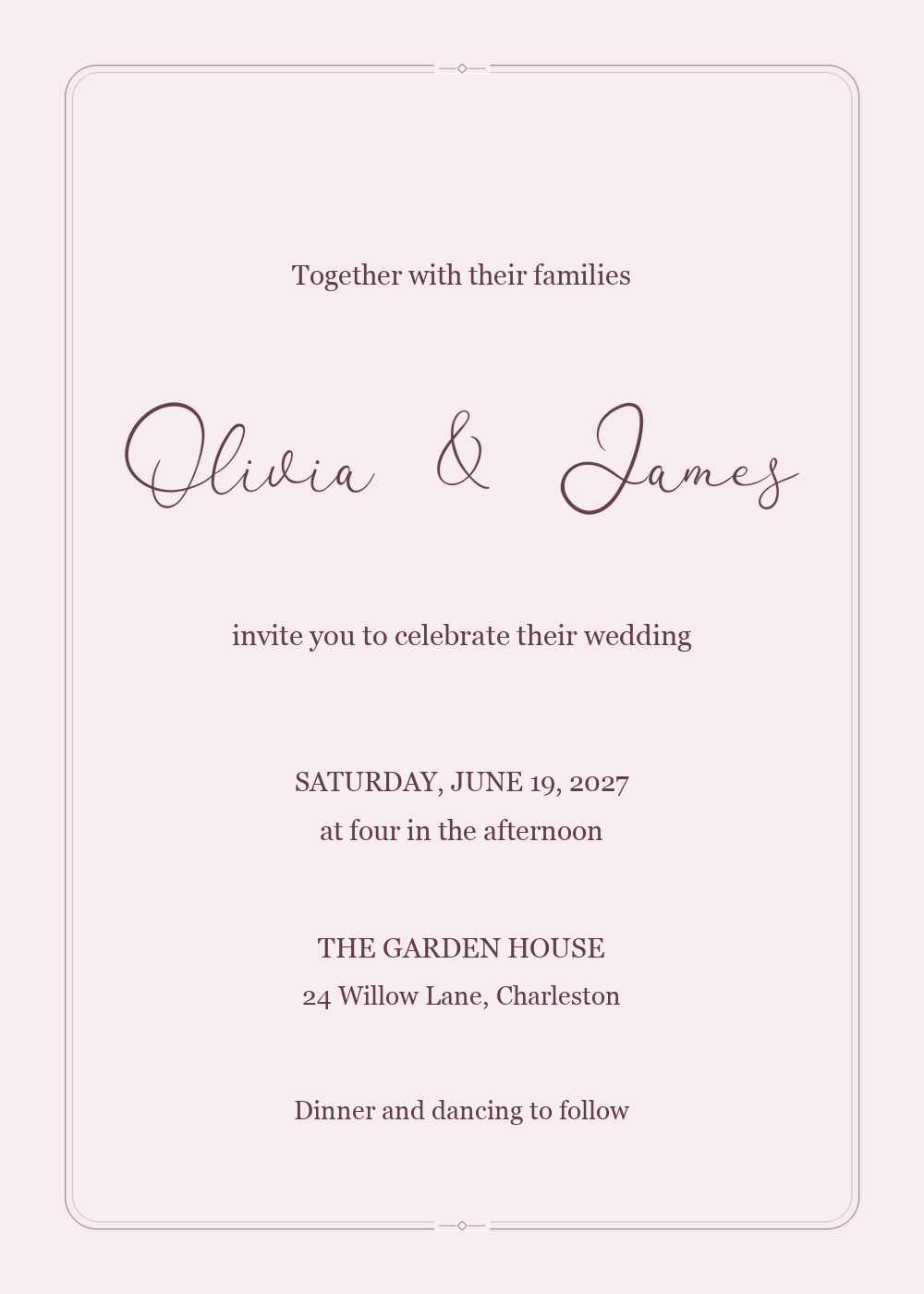
3. Airy romantic: Flanella + Georgia
The blush invitation shared by Papier on Pinterest uses oversized, fine handwriting against a quiet colored field. Take the spaciousness from that example. Our version uses Flanella for the names and Georgia for the supporting copy, with dark plum lettering on a pale blush background. The stronger contrast keeps the fine line easier to see than a very pale script would be.
Give the loops their own clear area inside a fine double-line frame. Rounded corners and small diamond accents add elegance while staying well outside the lettering. Keep supporting text regular rather than italic so it does not echo every curve of the script. If the names look faint in a proof, test a larger placement or a heavier font before adding an outline that changes Flanella’s character.
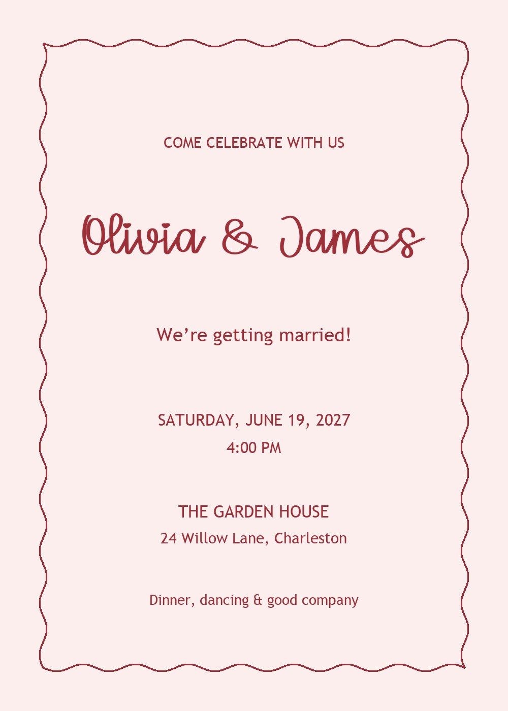
4. Playful romantic: Angglea Wedding + Trebuchet MS
The pink-and-red Cupid invitation suite on Pinterest combines a wavy border with small illustrations and calligraphy. Our version keeps only the border idea and a warm palette, allowing Angglea Wedding’s heart-shaped dots to supply the playful detail. Trebuchet MS gives the supporting lines an open, friendly appearance without introducing another decorative script.
Use short, conversational wording and keep the date and venue on straight, clearly separated lines. Leave space between the lettering and the waves; the border should frame the names, not touch their strokes. If you add illustrations, remove another decorative element first and reassess which feature attracts the eye.
5. Botanical: Amellinda Weddings + Georgia
Hello Tenfold’s Flora Suite on Pinterest places botanical illustration around relatively quiet areas of type. Our version pairs forest-green lettering on warm ivory with a light leafy border. Amellinda Weddings carries the names, Georgia handles the details, and the leaves follow the perimeter so the central text area stays clear.
Keep the names to roughly two-thirds of the card width, with equal side margins. Group the date with the time and the venue with its address; the gap between groups should be larger than the spacing within each pair. Use the same dark green for the names and details, with a lighter green for the leafy frame. Keep the leaves outside the text area so the heavier lettering remains the focal point.
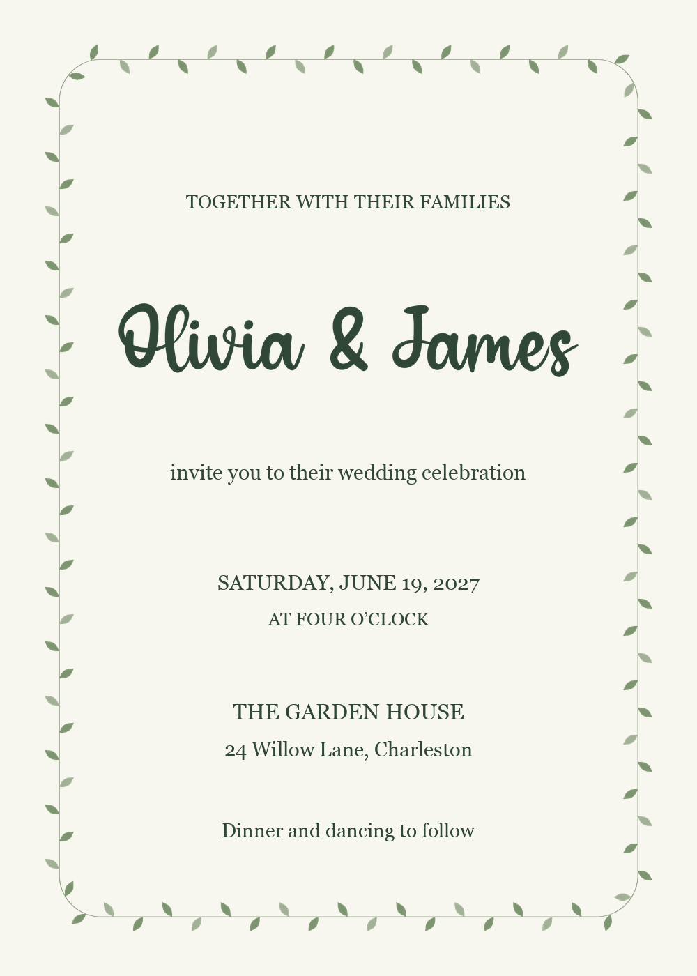
The generator creates one lettering image in one font per result. Set the supporting font, paper color, and decorations in your layout application. Keep the downloaded names proportional, replace all illustrative event details, and add your response instructions before treating any example as a finished invitation.
Create your shortlist in MakeCalligraphy
Enter the exact names
Open the Free Wedding Text Generator and replace the sample text with the names. The tool accepts up to three lines and up to 35 characters per line. Begin with one line if it fits, then compare an intentional multiline arrangement if the invitation shape calls for it.
Leave the date, address, and RSVP instructions out of the first comparison. You are choosing the display lettering at this stage. Testing all the invitation wording in the script at once makes it harder to see which part of the design is causing a problem.
Generate and compare a few candidates
Use the Wedding style group and select Generate to see your text in the available fonts. Open promising previews and record their font names so you can reproduce them. If the shortlist feels too ornate, explore a simpler group rather than adjusting an unsuitable font indefinitely.
For a more general handwritten or signature-style direction, the Free Calligraphy Text Generator offers another starting point. Use it when that particular look fits the invitation, rather than adding a second tool to the process automatically.
Adjust the layout and background
Choose the size, alignment, and line height that suit the lettering block. If you put the names on separate lines, inspect the space between descending strokes on the first line and capitals on the second. Center alignment can suit a centered invitation, while left alignment may suit a more editorial arrangement.
Switch Back off when you want to place the result over the invitation’s existing background. A transparent file lets the paper color or design beneath it remain visible. Keep a colored background only when it is meant to be part of the lettering artwork itself.
Export and place the actual result
Download the chosen PNG or SVG, then insert it into the invitation layout without stretching its proportions. Use PNG when your destination accepts raster images and SVG when the design workflow supports vector artwork. Keep the original export so you can place it again without copying a low-resolution preview.
For a printed invitation, confirm the required delivery format with the printer or template provider. SVG preserves scalable shapes, but an SVG file by itself does not establish a finished print specification. For a digital invitation, review the result at the size it will occupy on a phone rather than only on a large monitor.
Check names at the final size
The Size setting in the generator is a starting setting for producing the lettering, not a prescription for its physical size on paper. Two fonts at the same setting can produce different widths, heights, and apparent letter sizes. Compare the exported names inside the actual invitation dimensions.
Print a proof at the intended physical size and read it at a comfortable distance. Check the names and the smallest supporting text, then inspect the margins around long strokes. A desktop zoom level that makes everything look generous can conceal a cramped printed layout.
For long names, try a line break or a simpler font before shrinking everything. Avoid inserting extra spaces between connected letters to make a script look wider. That can disrupt the connections that create its handwritten rhythm; instead, change the available space, the line arrangement, or the font choice.
Carry the choice into other wedding pieces
Save-the-date cards
A save-the-date often gives the names more room than a detailed invitation. Use that space to establish the main lettering style, then keep enough of the same visual treatment when you design the invitation. The words may change, but the font and general rhythm can provide continuity.
Place cards
A place card asks a guest to recognize a name quickly. Test a long guest name as well as a short one before deciding that the invitation font will work at this smaller size. If the ornate version becomes difficult to read, simplify the name treatment while retaining another shared element, such as color or supporting type.
For reception labels and table numbers, see How to Choose Fonts for Wedding Table Signs for comparisons of fonts, wording, and one-line versus two-line layouts.
Welcome signs and thank-you cards
A welcome sign may give a short phrase plenty of room, while a thank-you card needs space for a personal message. Reuse the display font where it helps connect the pieces, and keep the longer message in readable supporting text. Consistency comes from a recognizable set of choices, not from setting every word in calligraphy.
Common problems when choosing wedding fonts
| Problem | Likely cause | Better next step |
|---|---|---|
| One name looks much smaller | Different length or capital shapes | Compare another arrangement or font |
| Loops collide between lines | Tight line height | Increase the spacing and preview again |
| Names become faint in print | Fine strokes at a small size | Test a larger or heavier candidate |
| Details compete with the names | Too many expressive fonts | Simplify the supporting typography |
| A white rectangle appears | Background was included in the export | Generate with Back switched off |
| A character looks wrong | Font coverage or glyph design | Test the exact spelling in another font |
Final invitation lettering checklist
| Check | Ready when |
|---|---|
| Spelling | Both names, accents, and punctuation are correct |
| Hierarchy | Names lead; date and venue remain easy to find |
| Readability | The complete names are clear at the final size |
| Spacing | Flourishes and adjacent lines have room |
| Export | The file has the intended background and proportions |
| Proof | The print or phone preview has been checked |
Conclusion
Choose wedding calligraphy with the real names, the real layout, and the final viewing size in mind. Compare a small shortlist, keep the supporting details readable, and test the exported artwork before committing to the stationery. The best choice is the one that fits the couple’s style while helping guests read the invitation comfortably.
Frequently asked questions
What is the best calligraphy font for a wedding invitation?
There is no single best choice for every pair of names and every layout. Compare the exact wording in a few fonts, then choose the one that suits the invitation and remains readable at its final size.
Should all the invitation text use the same script font?
Usually, the names benefit most from decorative lettering. A simpler supporting font makes longer details easier to read. Start with those two roles and add more variation only when it solves a specific design problem.
Can I create the whole invitation in the generator?
The tool creates a short lettering image with one selected font per result. Assemble the full invitation, supporting copy, and other design elements in a separate layout application.
Can I use a transparent background?
Yes. Switch Back off before generating the final result. The transparent image can then sit over the invitation’s own background without adding a fixed white rectangle.
Is PNG or SVG better for wedding lettering?
PNG is convenient for image-based layouts. SVG is useful in workflows that accept scalable vector artwork. Choose according to the destination and confirm the printer’s requirements for the completed invitation.
What should I do with long names?
Try a simpler typeface or put the names on separate lines. Keep within the tool’s three-line and 35-character-per-line limits, and check that the change improves the layout rather than merely making it fit.
Can I paste the generated lettering into a text-only invitation field?
A PNG or SVG is an image, so the field must support images. Fancy Text vs. Font Images: Which Should You Use? explains the difference between a downloadable lettering image and decorative characters that remain text.